Sunday, 18 August 2013

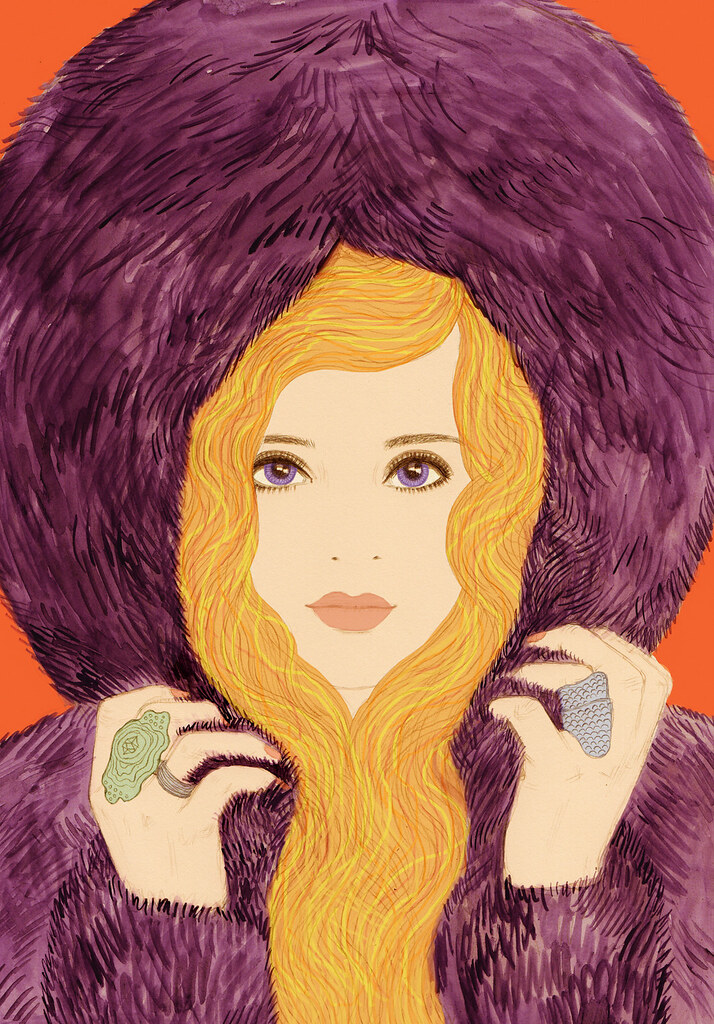
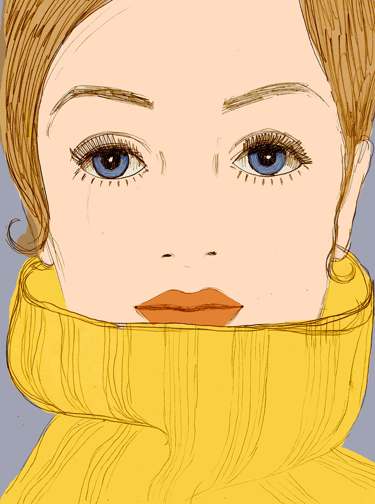
Illustration for the cover of SHOP Copenhagen

SHOP COPENHAGEN

This is an illustration I created in July for SHOP Copenhagen.
The Copenhagen issue was released to coincide with Copenhagen fashion week. Brands who showed at CFW feature in the issue, and one of the running themes is 'daring Danish design', bold design with a quirky but still very elegant edge very much influenced by the 1960s.
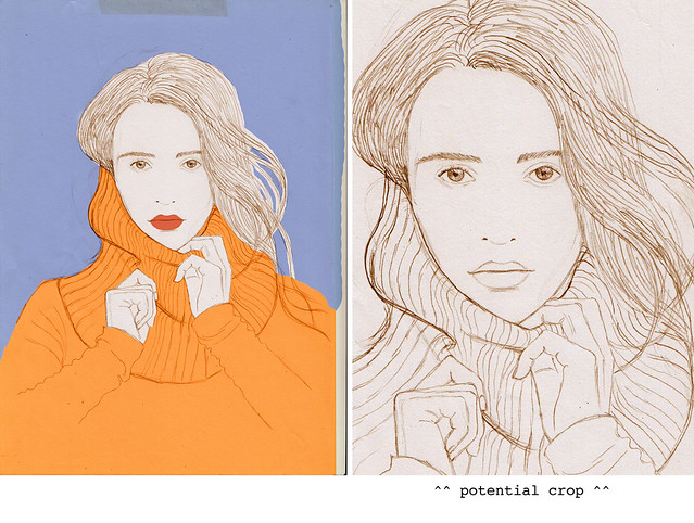
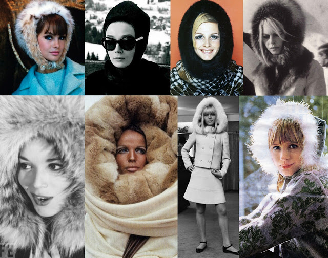
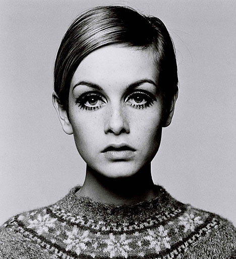
The editor wanted 'a straight on portrait of a figure surrounded by a big fluffy roll-neck jumper - very 60s esq - really exaggerated as though the jumper is going all up around her face, her head almost filling the frame, big hair coming over the jumper and filling in the frame above. Really bold, a bit quirky but also looking really sophisticated. Her hands could be holding the jumper fabric as though holding it up around her face a bit, enjoying the fabric.
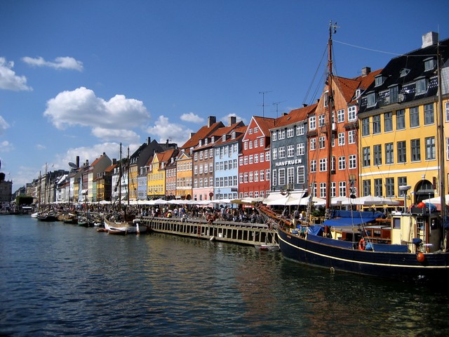
Colour wise, we'd love to include hits of colours from the buildings in the Nyhavn area which are very iconic to Copenhagen.'

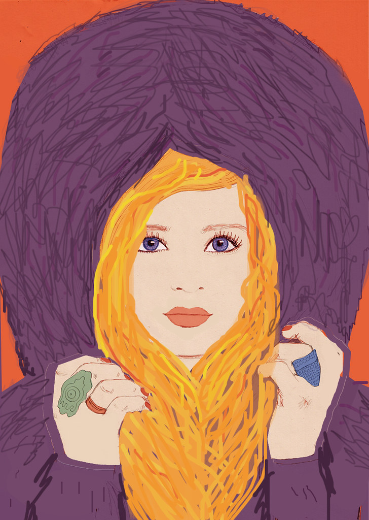
SKETCHES:

SHOP COPENHAGEN sketch 3

SHOP COPENHAGEN sketch 2

SHOP COPENHAGEN sketch 1

inspiration...

SHOP COPENHAGEN inspiration

SHOP COPENHAGEN inspiration

SHOP COPENHAGEN inspiration

Sunday, 4 August 2013

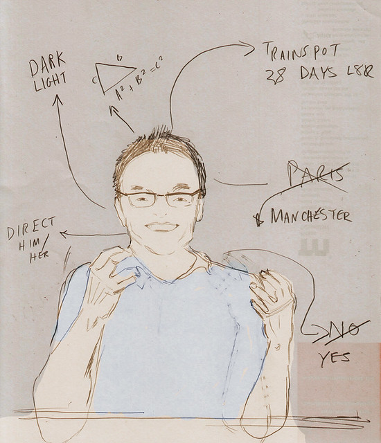
Illustration of Danny Boyle for TOWN magazine

DANNY BOYLE final

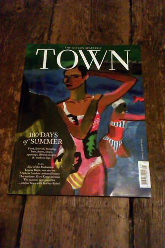
This is an illustration I created of British film maker Danny Boyle, for the most recent edition of TOWN, a London based magazine which 'celebrates and curates the best of London life each season, covering everything from fashion, style, arts and culture to events, openings, food and drink.'

I created the image using traditional drawing using ink and pencils, and then I scanned it into the computer and tinkered with the colours...

For issue 5, published for Summer 2013, Town 'turns pastoral, with stunning photographs of the city’s waterways by Venetia Dearden, a feature on Londoners who’ve brought their country pursuits to the city, and a selection of the very best products that are Made in London. Plus Danny Boyle, Harvey Keitel, Cornelia Parker and Guy Chambers.'

Danny Boyle is an English film director, producer, screenwriter and theatre director, best known for his work on films such as Slumdog Millionaire, Shallow Grave, 28 Days Later, 127 Hours and Trainspotting.
The Town magazine article was timed to coincide with the much anticipated new film by Boyle, Trance, which follows the story of 'an art auctioneer who has become mixed up with a group of criminals who partners with a hypnotherapist in order to recover a lost painting.'

Read more about Danny Boyle here.

Detail of the image:

DANNY BOYLE 1 detail

In the end the graphic background was removed and we opted for a simple wash background:

DANNY BOYLE final

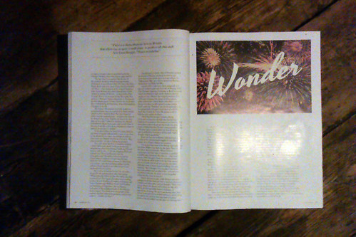
I also created this graphic for the second page of the article:

WONDER

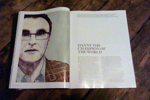
The images in the magazine (apologies for poor quality)

Danny Boyle THE TOWN

Danny Boyle THE TOWN

Danny Boyle THE TOWN

Sketches:

DANNY BOYLE sketch

DANNY BOYLE sketch

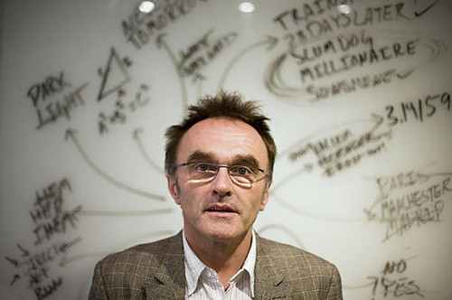
Reference image of Danny:

DANNY BOYLE reference image

Saturday, 3 August 2013

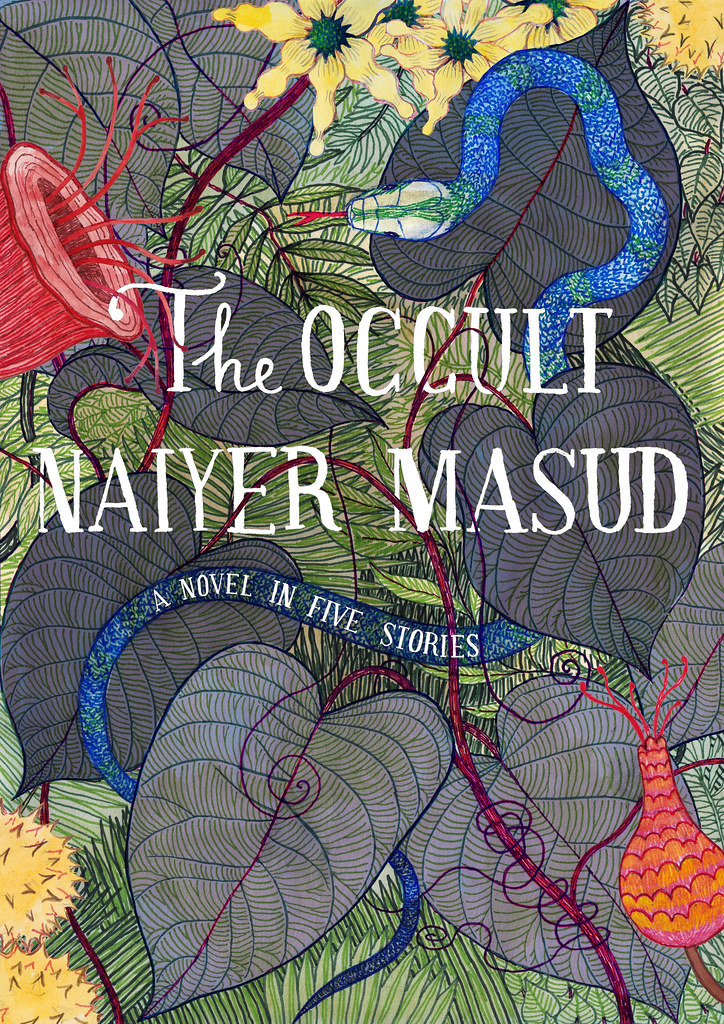
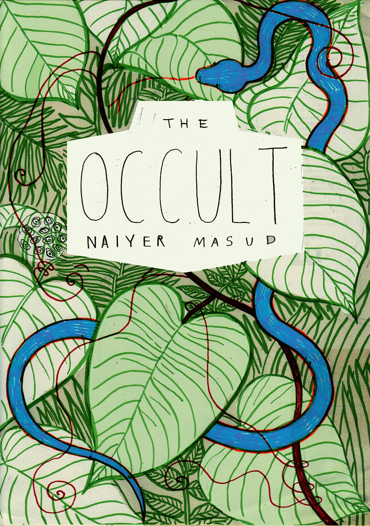
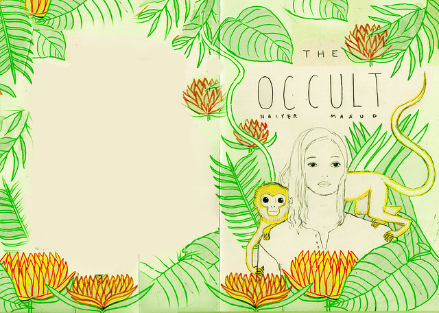
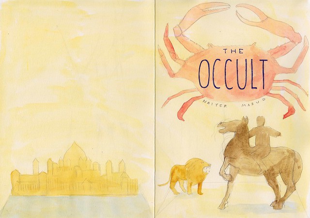
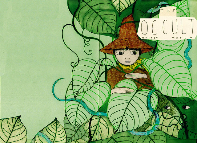
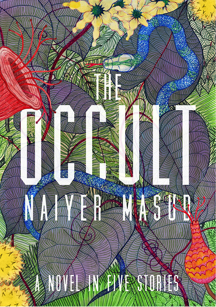
THE OCCULT Book cover illustration

The Occult

A few weeks ago I completed the illustration for the cover of 'The Occult - A Novel in Five Stories', published by Penguin Classics India.

From the publisher:

"Five long stories form the first collection published by the greatest living Urdu short story writer Naiyer Masud. These beautiful and bizarre stories have no perceptible beginnings, plots or endings. The narrator is a young man who has left behind his home and family for mysterious reasons (he may or may not be responsible for a girl’s death) and wanders from place to place forming strange connections.
The stories follow the logic of dreams and are set in dreamscapes. The architecture (of the stories and the geographies in which they are set) is both fluid and precise, as in a dream. Together the stories are ‘inter-textured, rich in suggestion and allusions that unfurl subtly but necessarily underneath the seeming disconnectedness of the stories, giving them an overpowering sense of an undefined existential unity.’"

Here is what Wikipedia has to say about Naiyer Masud:

"Naiyer Masud is one of the foremost short story writers in Urdu. He was born in Lucknow in 1936 and has spent nearly all his life there, working until his retirement as a Professor of Persian in Lucknow University. He is the author of many scholarly books and translations (notably of Kafka), but is best known for his short stories, collected in the volumes Ganjifa, Simiya, Itr-e-kaafoor, and Taoos Chaman Ki Myna. For the last, he was awarded the 2001 Urdu prize of the Sahitya Akademi and the Saraswati Samman in 2007. He also received the honor of being the subject of the 1997 entire issue of the Annual of Urdu Studies. A large selection of his stories have been translated into English by M.U. Memon in the volumes The Snake Catcher and Essence of Camphor. Masud is the son of Syed Hasan Masud Rizvi Adeeb, also a Lucknow University Professor of Persian and a famed scholar of dastaan, and the brother of the noted satirist Azhar Masud."

Scroll down to see sketches, inspiration, and some extracts from the book...
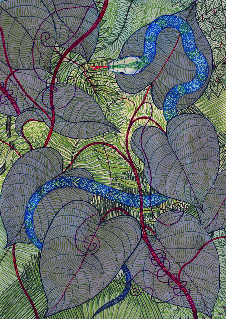
THE OCCULT drawing

2nd draft:

THE OCCULT 2nd draft

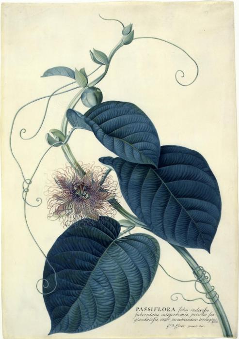
I was in a part of the jungle where green vines were spread out over the tree trunks and the ground. These vines had large, dark green leaves with light green protruding veins and they were so succulent that when they were bent they snapped in the middle, releasing jets of water. And, in fact, the atmosphere there was suffused with exceedingly fine sprays of water. In short, that area of the jungle was completely different from the places where the presence of snakes might be suspected. But it was precisely here that the thought of snakes occurred to me and I began to imagine their presence near every moving leaf, so much so that it became difficult for me to press ahead. I stood there surrounded by a sea of green vines. The movement of their leaves resembled the rise and fall of waves, and the objects below them, which seemed to be crawling toward me, made it difficult even to stand.

1st draft:
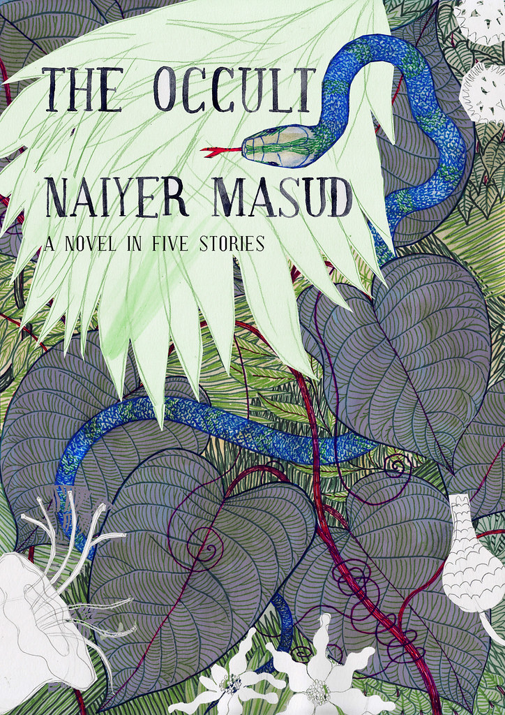
THE OCCULT 1st draft

I scanned the area for a clearing but there were green vines around me and it was impossible to tell where the terrain rose and fell beneath their large succulent leaves. That the terrain was uneven was beyond a doubt. I remembered how several times, as I trudged forward, I had been plunged up to my waist in leaves and, wading through these leaves with my hands, I had to climb up a slope. That is to say, the sensation of wading through the leaves was still fresh on my hands. At that moment I stood rooted to the ground, finding it difficult even to budge. Suddenly something stirred close to my feet and, without determining its direction, I moved. I stepped on something which was alive and which became even more alive. I felt a sort of prick on my foot. There was a movement in the leaves and a hood rose from beneath them. For a brief second I saw tiny eyes staring at me and then I heard what sounded like someone sighing nearby. Meanwhile, the hood dived under the leaves. The leaves swayed and I saw a long, slithering body retreat. The leaves churned violently and continued being churned up for some ways into the distance.

Work in progress in my studio:
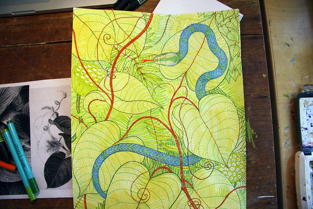
THE OCCULT work in progress

Sketches:

THE OCCULT sketch

THE OCCULT sketch

THE OCCULT sketch

THE OCCULT sketch

For some distance I looked around at the jungle with interest. Then I was reminded of the curios neatly arranged in the outer reception room of my house. I couldn’t remember exactly what those curios were so I tried hard to recall each and every one of them. One was a lion made of some kind of metal. It stood on its hind legs with its mouth wide open as though it were roaring. Its eyes were crafted from some precious stone and they had disappeared several generations before me. Yet the lion’s only importance lay in its missing eyes. Close by the lion, but larger than it, was a horse molded from some reddish-brown material with a rider of the same material mounted on it. One of the rider’s hands was poised in the manner of someone wielding a sword, but the hand was empty. The sword of that empty hand was sorely missed, but an elder of the family used to say that the rider had, in fact, held a scale, not a sword, in that hand. In my own time, mostly due to my own carelessness, the upper half of the rider’s body had also broken off and a clever artisan had been commissioned to put it back together. I remember that when the upper half came off, it revealed that the inside material was of a rather dark red color and it gave off a strange scent which conjured up memories of old things when it was inhaled. On the wall across from the lion and the rider hung a crab fashioned from numerous tiny chips of animal horn. The pieces had been put together in such a way that the slightest touch made the entire crab wobble and appear as if it were crawling along the wall. I hated this crab; sometimes I even feared it. It was a specimen of a craft practiced by some lost tribe whose name I could never remember. The curios in the reception room also included a miniature palace built from tiny stone bricks of different colors. It was a complete palace with arches, columns, turrets, etc. The turrets, especially, were exceedingly beautiful and guests often marveled at the delicate workmanship of their ornamental serratures. It used to be said about this palace that at some point in time there really was a full-scale likeness of it, the ruins of which could still be seen, and that the miniature had been made to serve as a model for the actual palace.

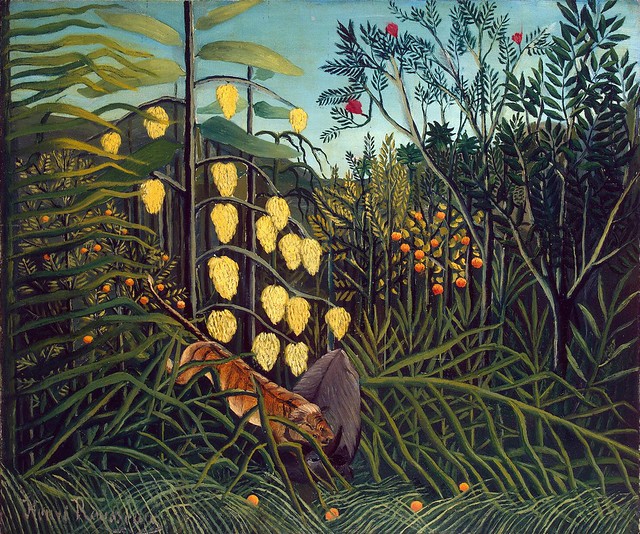
Inspiration:
THE OCCULT reference image

THE OCCULT reference image

Monday, 29 July 2013

WOW Stage at Glastonbury 2013

993324_10151709162148010_549859636_n

1078671_10201676158574155_1751069725_o

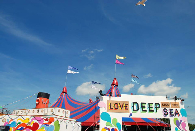
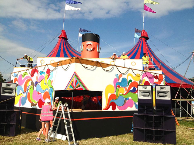
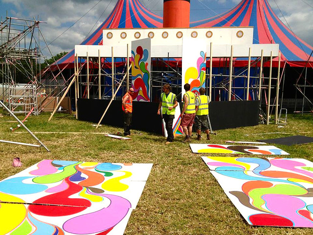
At this year's Glastonbury Festival I was lucky enough to have been part of the amazing team (aka. TEAM LOVE) that brought you the WOW Stage in Silver Hayes.
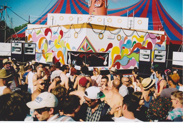
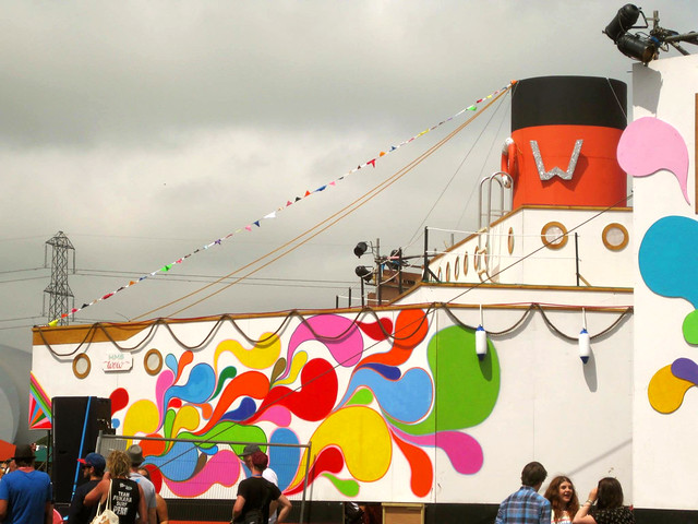
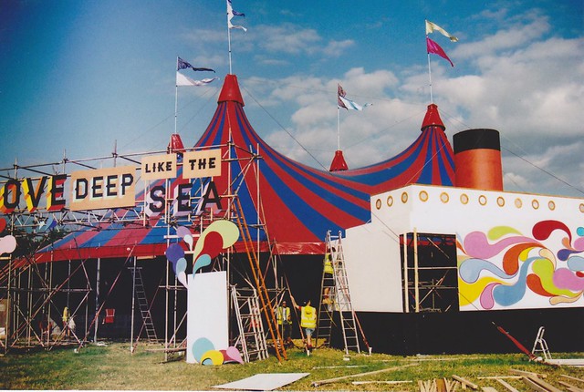
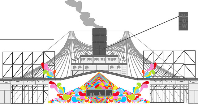
This year the WOW Stage was transformed into a psychedelic ocean liner, featuring daily boat parties aboard (well, in front of) the HMS WOW.

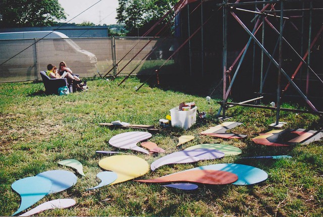
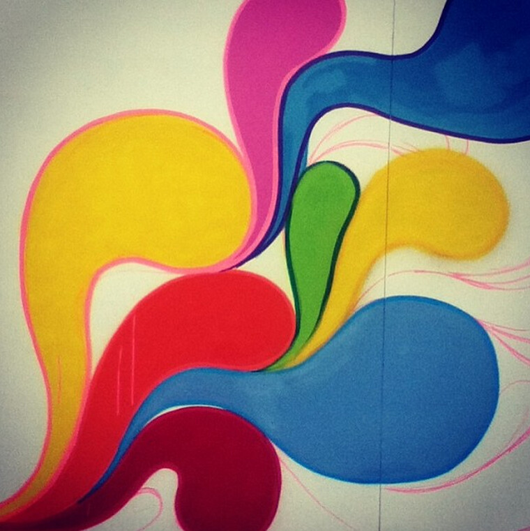
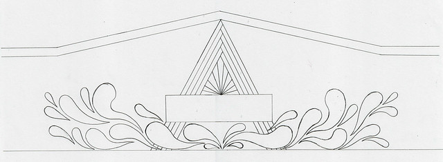
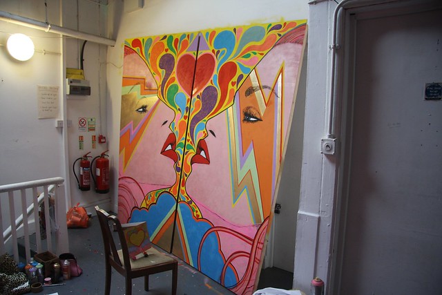
I worked with two of the Hot Soup House designers - Russell Henry and Laurence Hassan on the design for the boat. Russell basically designed the structure of the boat facade we built, Laurence designed the 'Love Deep Like the Sea' lettering, and I designed and painted the mural of swirly, psychedelic, colourful shapes that decorate the white surface of the boat.

Being part of the WOW Stage team for the first time was such a great experience, and I cannot wait for Glastonbury 2014!!

From The Ransom Note website:
"Glastonbury Dance Village’s ‘WOW’ Stage traces its history back to 2008 when Dave Harvey and Tom Paine founded Team Love to programme the Igloo Tent. It was the first all-night venue in Dance Village with acts like Don Letts, Tayo and Metronomy."

Here's what Futureboogie's Dave Harvey has to say about the WOW:
"I think The Wow provides a counterbalance to the more established acts on East and West. We really try to pick up on artists who are coming up, pick them out early and get them involved – and again this year we’ve been really lucky to do so with lots of acts like Julio Bashmore, Space Dimension Controller, Lone, Floating Points, Funkineven, Fatima, Maya Jane Coles, Subb-an, Hyetal who have really come into their own in the last few months and our stage is probably the best place for them to be at the festival."

Scroll down to see more pictures, and see some work in progress shots and sketches!

1013414_10152990899480484_1734068252_n

1049229_10151436682096105_1427559607_o

Under construction on site:

1074834_10201676167654382_1351330034_o

980345_10201676167974390_912679526_o

945354_10152990892710484_1120971264_n

The mural half painted at a secret location somewhere in Bristol, a few weeks before the festival:

IMAG0464

1016062_10152872495190214_868526153_n

Screen shot 2013-07-25 at 6.41.14 PM

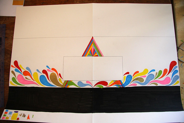
Concept sketches:

IMG_7735

glasto

wowtent_front

Silver Hayes promo, featuring the WOW:

^^^ Spot us in this promo for Silver Hayes 2013 - look out for the big, bright party boat! ^^^

Saturday, 13 July 2013

Love Saves the Day LOVE BOX

8979581820_4783117f0c_o

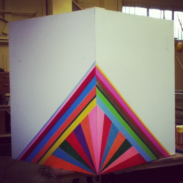
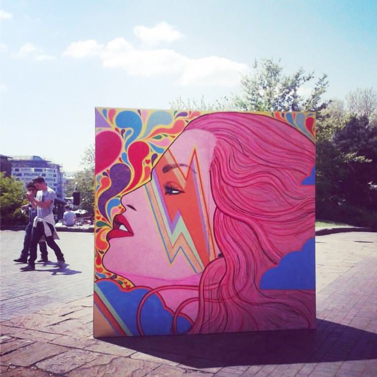
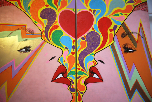
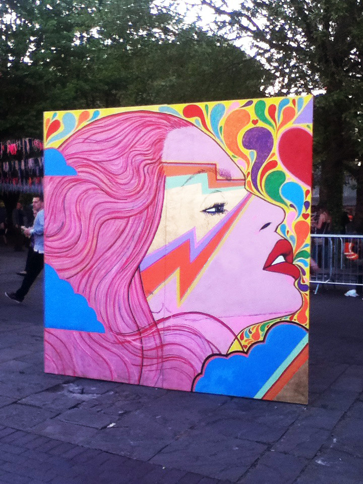
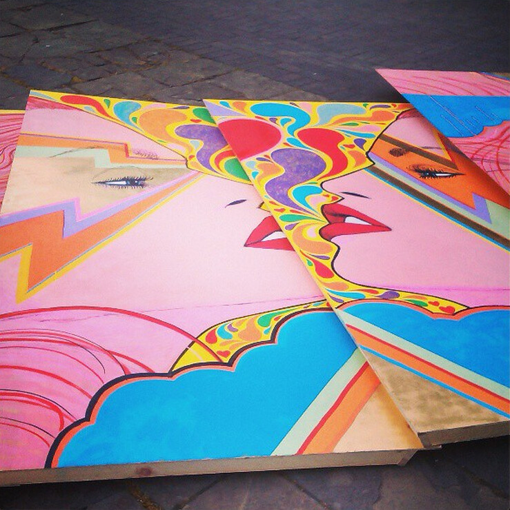
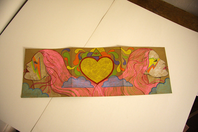
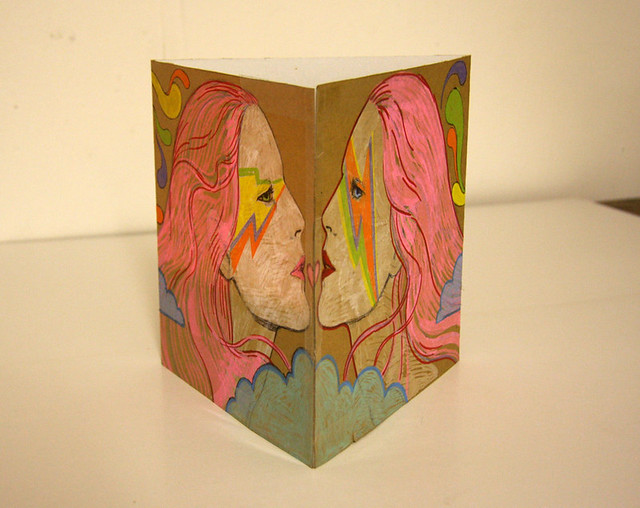
Love Saves The Day was a dance and electronic music festival that took place on Saturday the 25th of May 2013 in Castle Park, Bristol. The organisers asked me, and several other local artists in Bristol, to create unique 'Love Boxes', which would be placed around the site as decor.
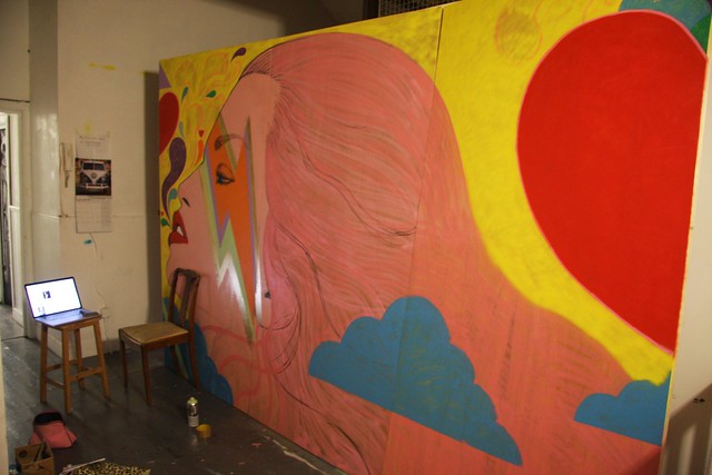
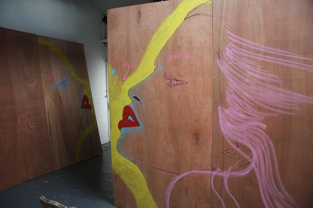
The box was made up of 6 panels of 8 ft by 4 ft ply, which I put together into a triangle box shape. Scroll down to see some of the design process, and some shots of work in progress in my studio...

IMG_7722

1069028_10152971151765214_1582530038_n

Onsite in a big pile before being built:

LOVE SAVES THE DAY Love Box Boards onsite and ready to be constructed

Work in progress in my studio:

IMG_7723

LOVE SAVES THE DAY Love Box WORK IN PROGRESS

LOVE SAVES THE DAY Love Box WORK IN PROGRESS

LOVE SAVES THE DAY Love Box WORK IN PROGRESS

Mock up:

LOVE SAVES THE DAY Love Box MOCKUP

IMG_7670

References:

LOVE SAVES THE DAY Love Box REFERENCE IMAGE

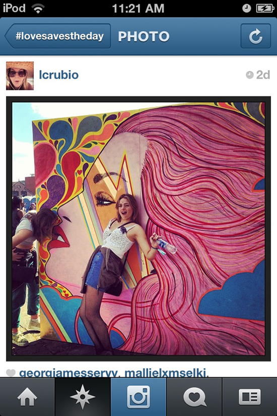
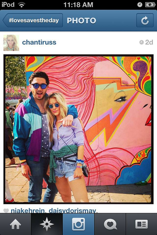
Instagram screengrabs of random strangers with the box :-) :

1062834_10152971162355214_807820932_n

1056846_10152971162180214_1925831785_n