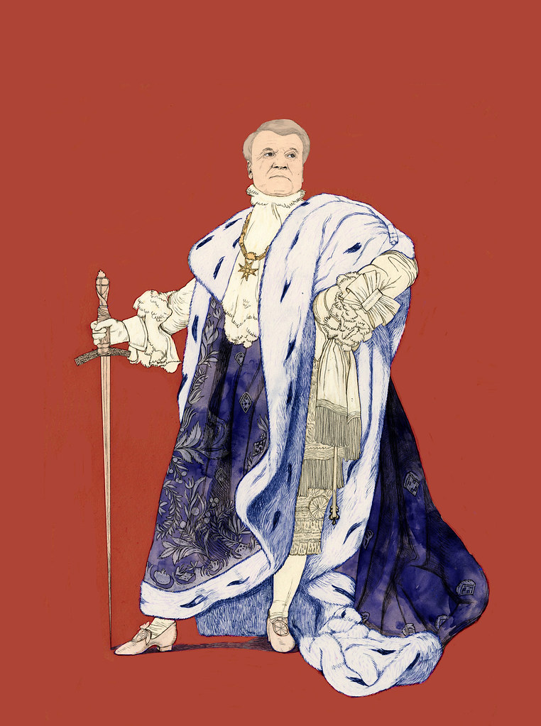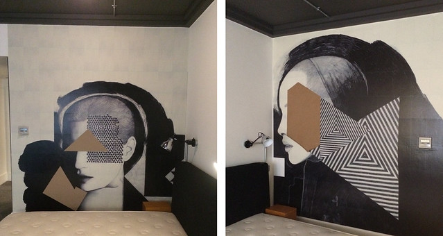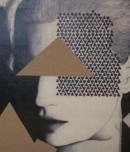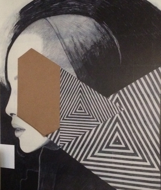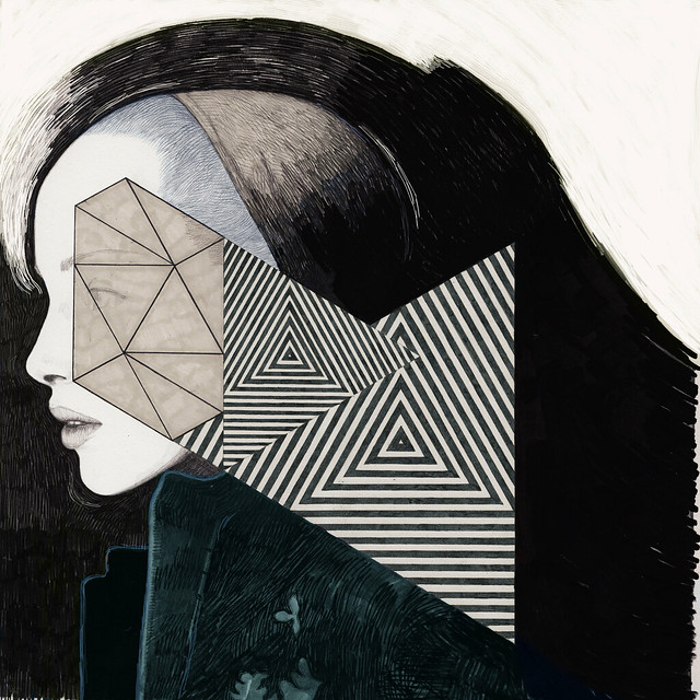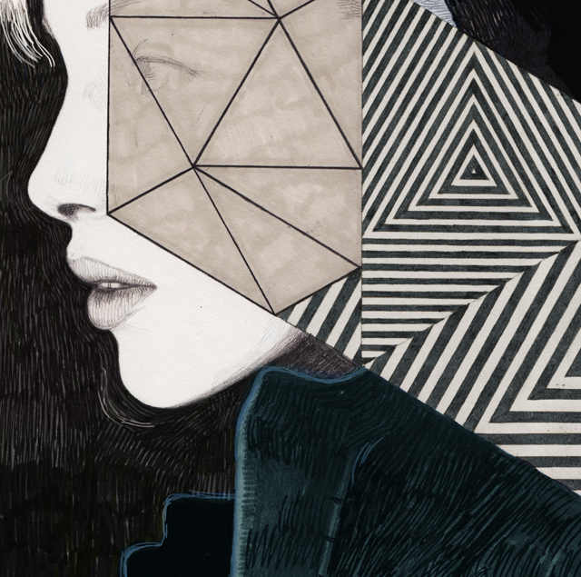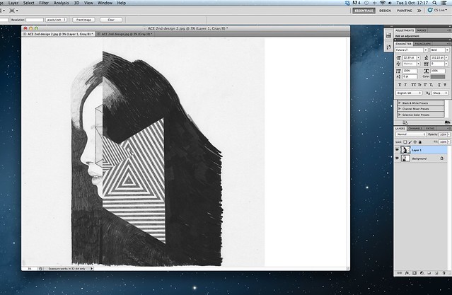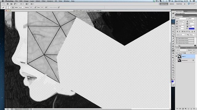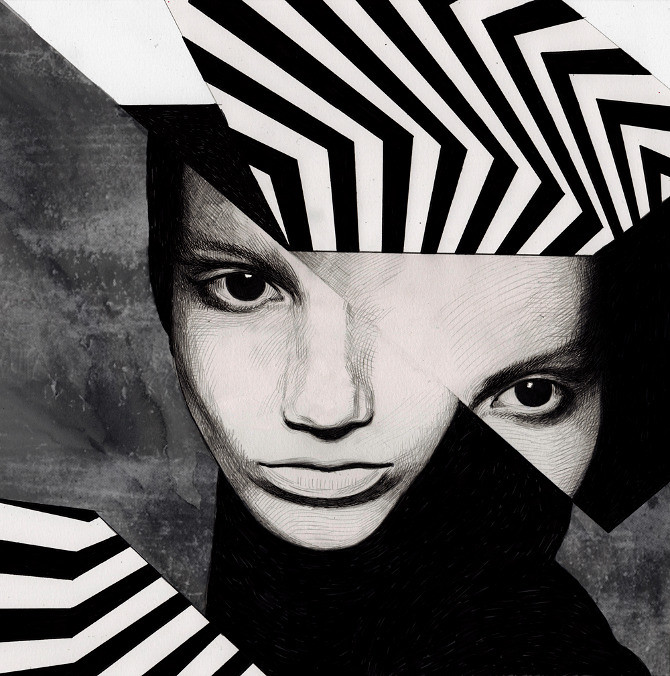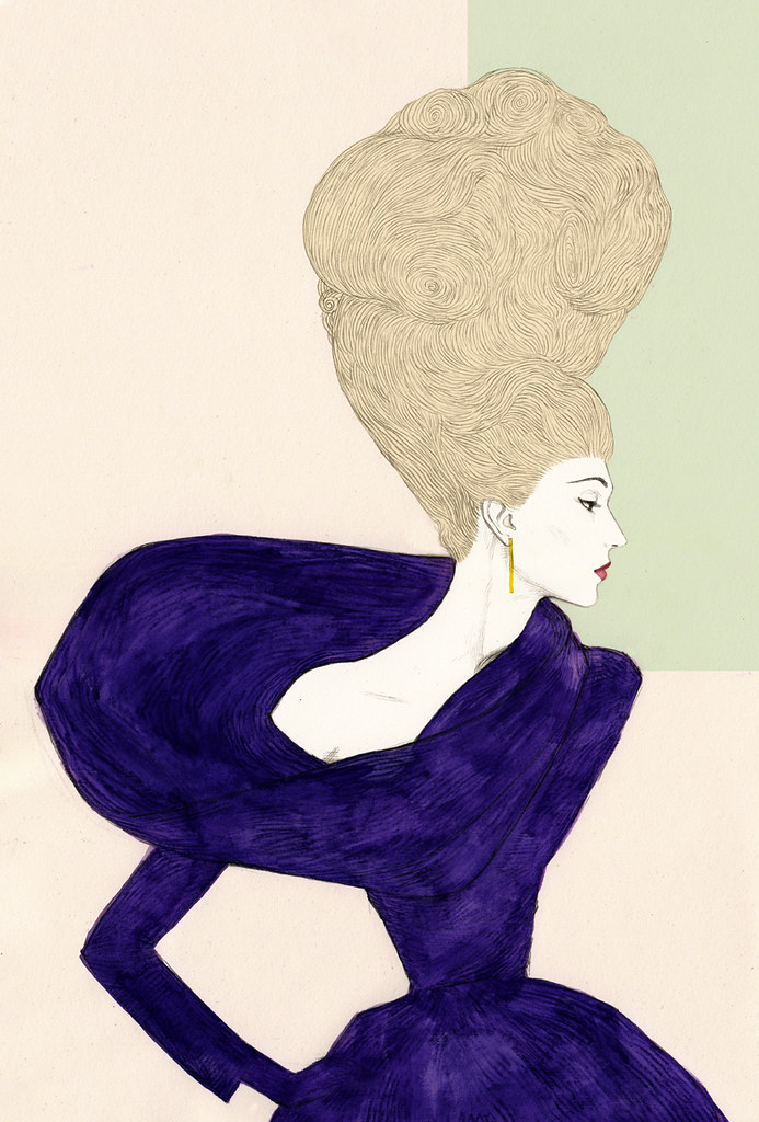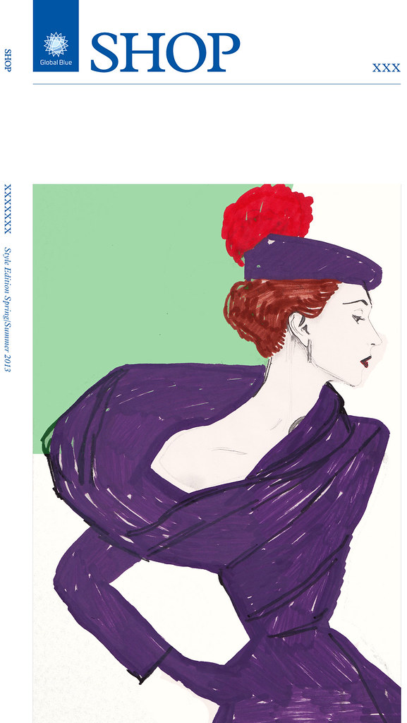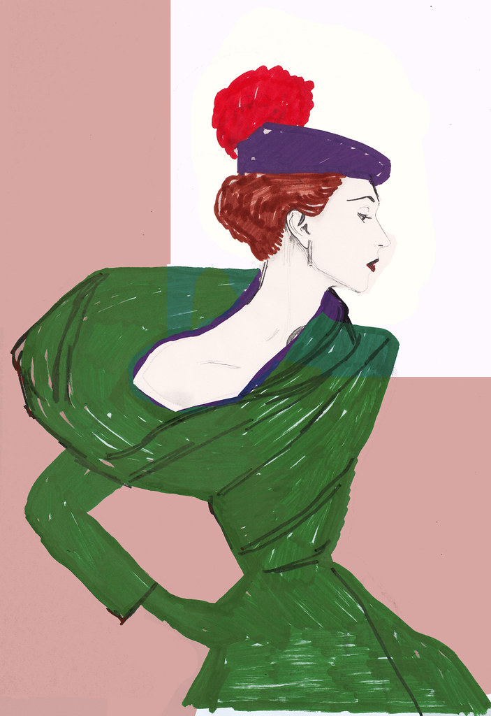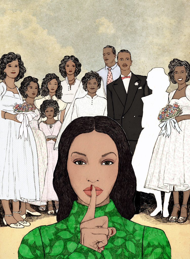
This is an editorial illustration I completed a few weeks ago for Essence magazine in the USA.
"ESSENCE is the premiere lifestyle, fashion and beauty magazine for African-American women. With its motivating message, intimate girlfriend-to-girlfriend tone, compelling and engaging editorial lineup and vibrant and modern design, ESSENCE is the definitive voice of today's dynamic African-American woman. ESSENCE speaks directly to a Black woman's spirit, her heart and her unique concerns. Every month African-American women rely on ESSENCE for editorial content designed to help them move their lives forward personally, professionally, intellectually and spiritually. Sections such as Work & Wealth, Healthy Living, and Looks We Love cover topics that focus on career and finance, health and lifestyle, and fashion and beauty and share an intimate connection with readers. In 2008, ESSENCE won 12 New York Association of Black Journalists awards in the Investigative, General Feature, International, Business/Technology, Science/Health, Arts & Entertainment, Personal Commentary, Public Affairs and Online categories. The publication has a monthly circulation of 1,050,000 and a readership of 8.5 million. The first issue of ESSENCE hit the newsstands in May 1970, with a circulation of 50,000."
The illustration I made was for an article written about 'family secrets'. The article explored the story and experience of a woman who grew up without her real father, a man who denied her existence.
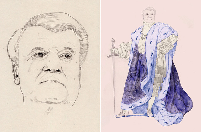
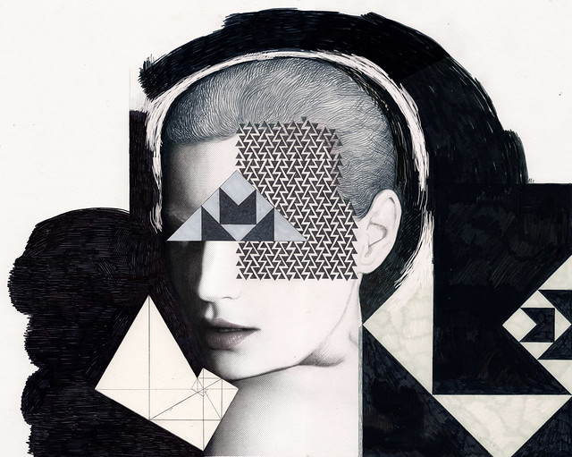
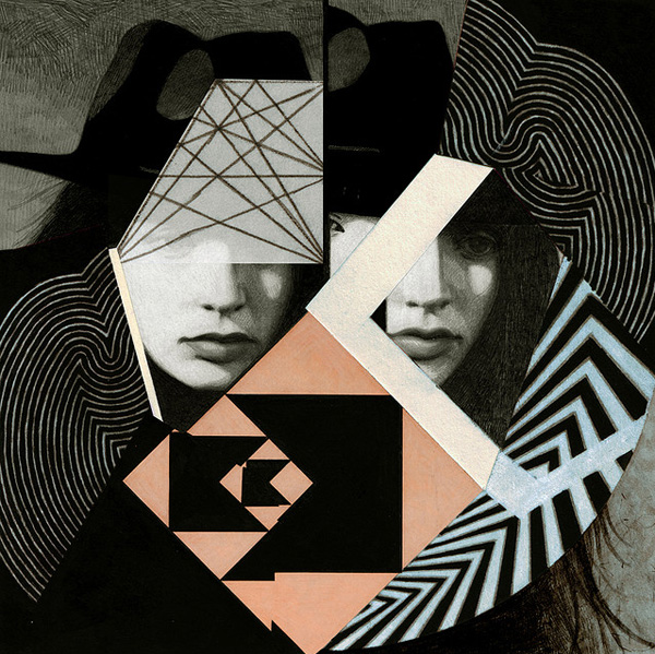
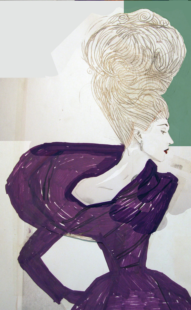
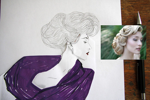
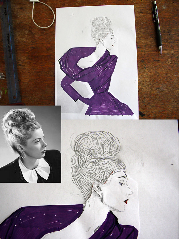
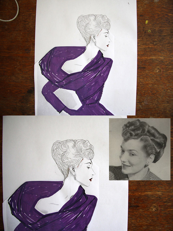
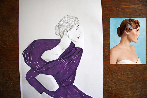
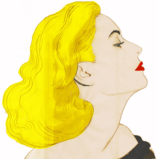
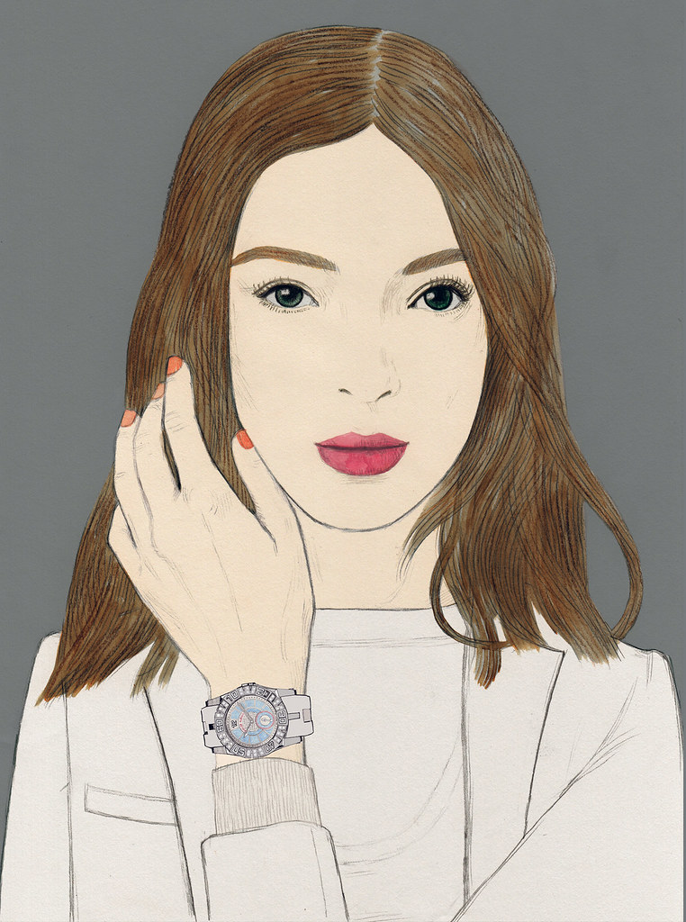
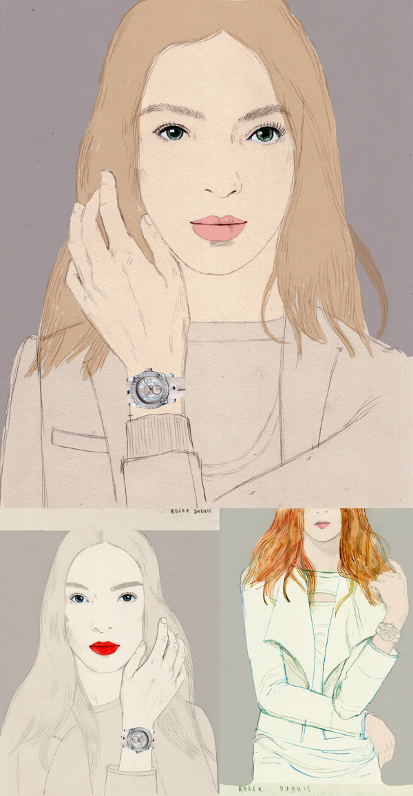
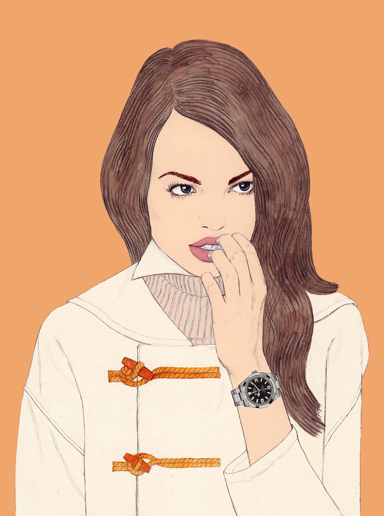
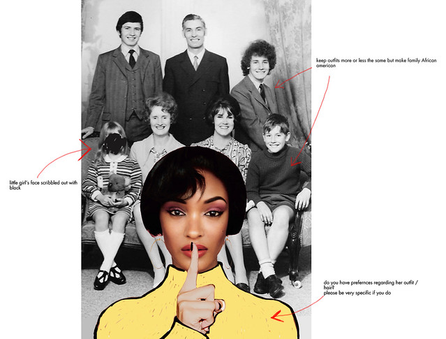
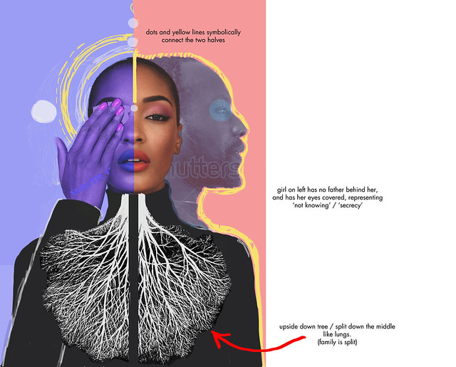
Sketches:
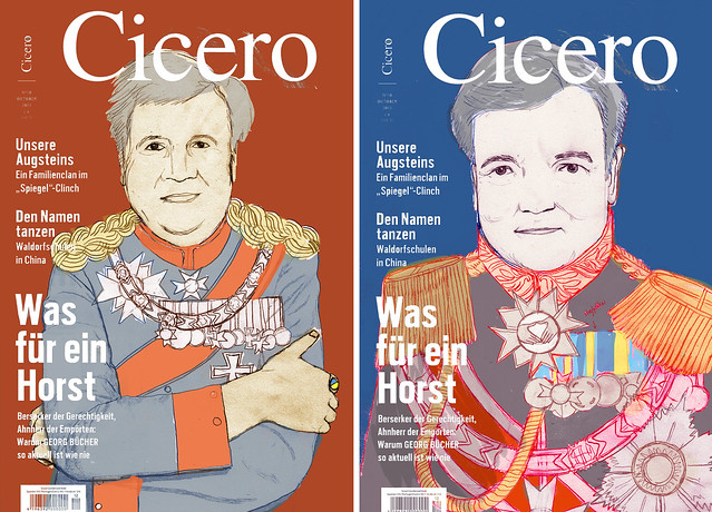
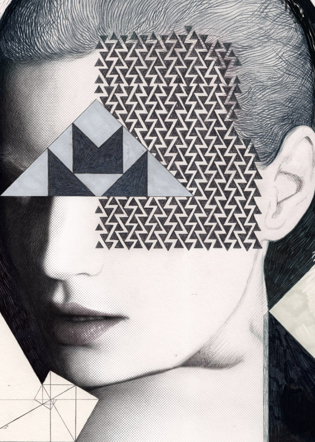
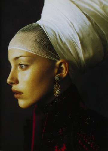
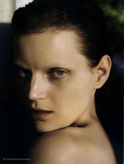
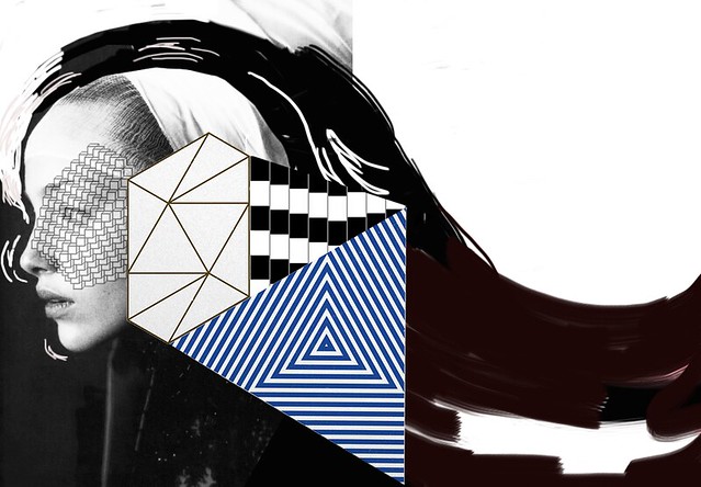
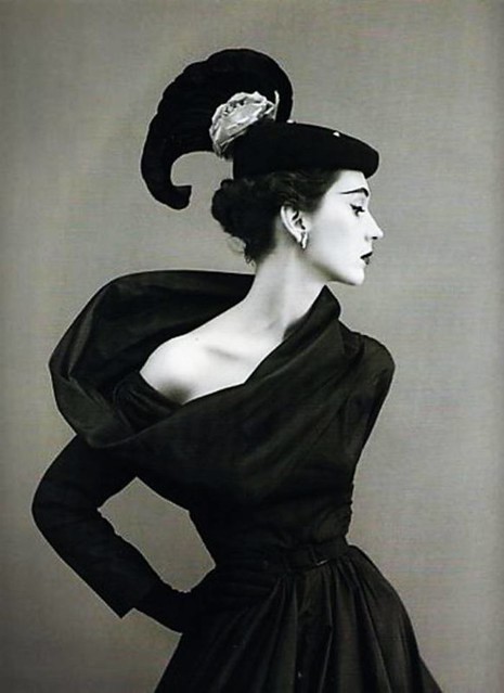
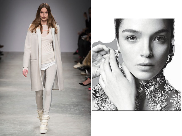
Reference: