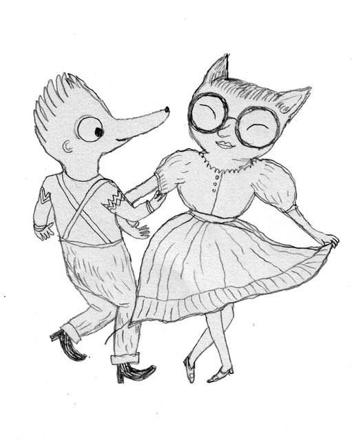
Received my copy of CHRONOS Femme from Japan today!
Click here to read more about this project.

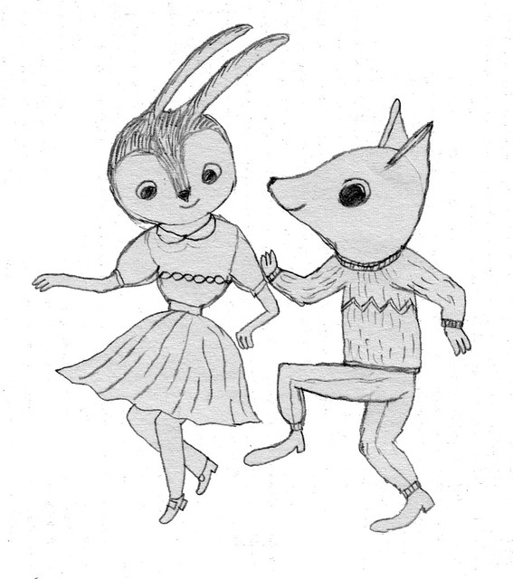
Received my copy of CHRONOS Femme from Japan today!
Click here to read more about this project.
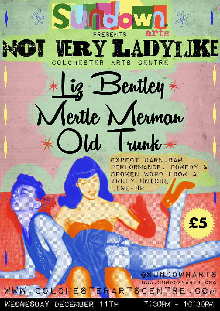
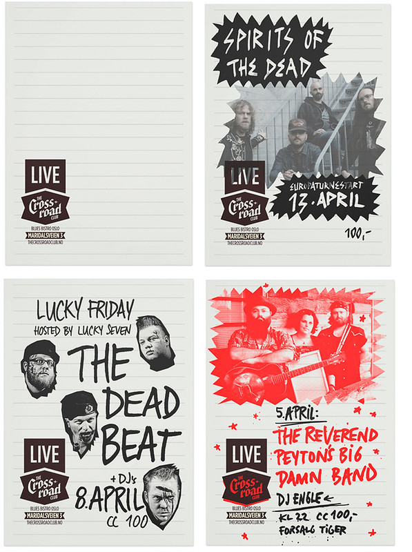
Knocked up this flyer this week for the fine folks at SUNDOWN arts - in their own words "a diverse arts event playing host to live music, spoken word, comedy, short films, DJ’s and any other performance art. It is based in Southend-on-sea but now curates events in London and throughout the UK, including many festivals."
From the organiser, about this particular event: "Not Very Ladylike features emerging theatre company Old Trunk, with one of their witty, unique plays/sketches. There is also the comedy poet Liz Bentley whose material is pretty edgy. Then the performance artist Caroline Smith, who also does some unique, raw material.
So the concept is an all-female cast with edgy, unique material that pushes the envelope a little.
I like the look of fifties style women from those forties and fifties style adverts, where women were supposed to be prim and like a lady but maybe give the flyer a punk rock feel to it. Or a pop art feel."
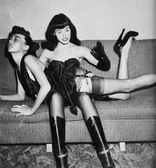
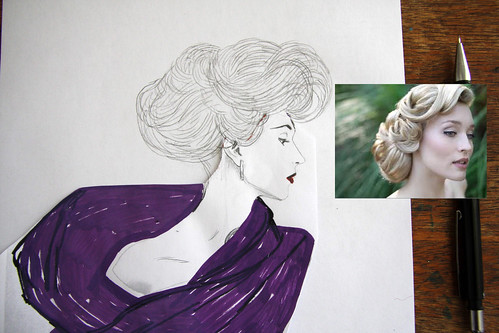
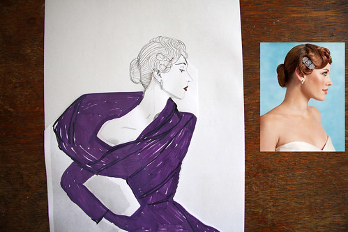
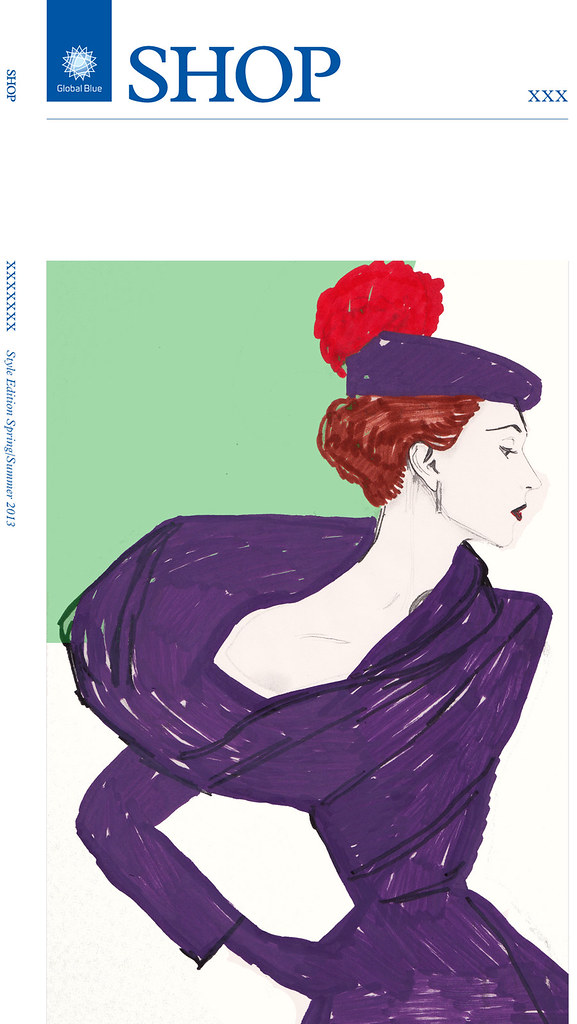
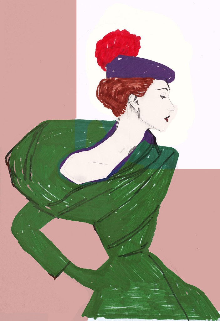
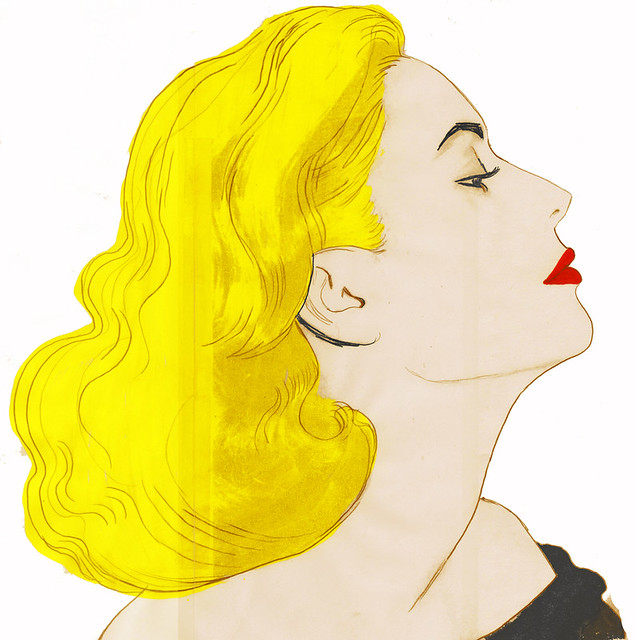
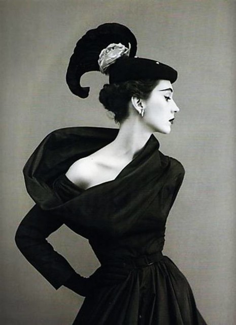
This is the 2nd image of three that I have created for the international SHOP series, published by Global Blue. This one was for their Italy issue. The concept was old school glamour - I researched images of Veronica Lake and Grace Kelly, and 1940s fashion imagery. Finally I found a striking image of a 1940s model wearing a dress that really accentuated her small frame. I sketched it out, and then redrew the image several times, adjusting the hair and dress to exaggerate the proportions.
Scroll down to see the process, sketches, and reference imagery...
Click here to read an interview I did with Global Blue, about making the image.
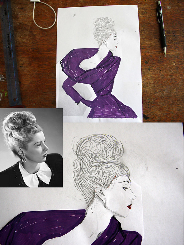
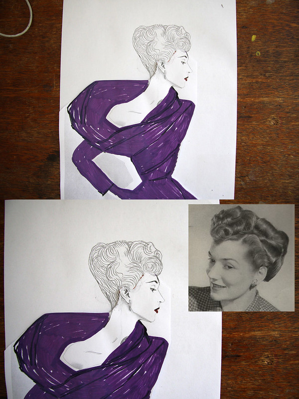
INITIAL SKETCHES...
INSPIRATION & REFERENCES

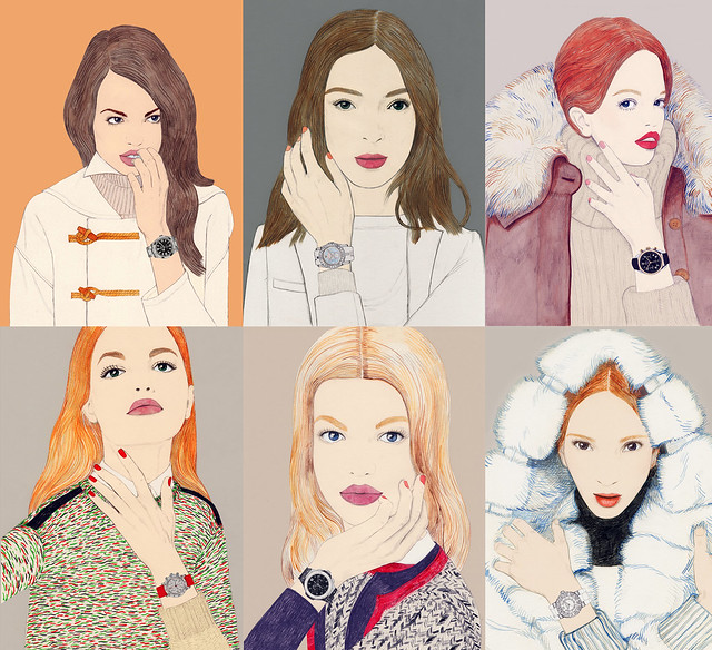
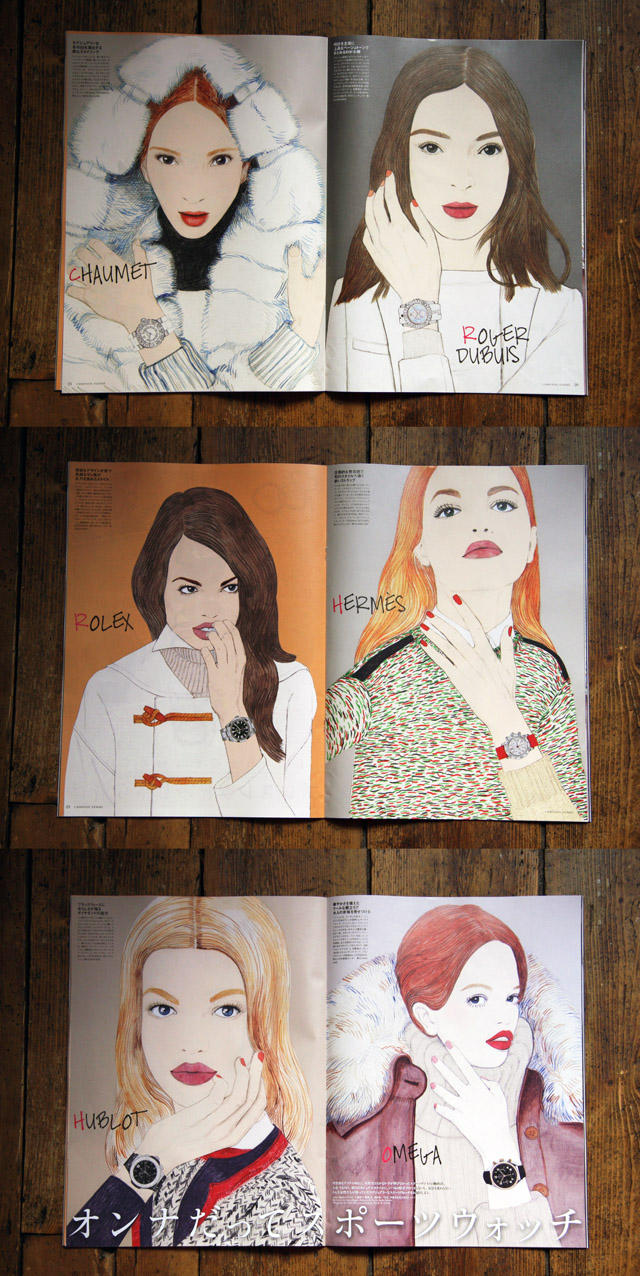
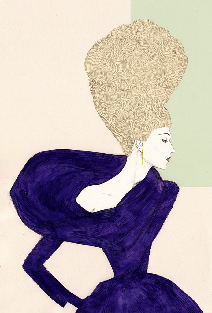
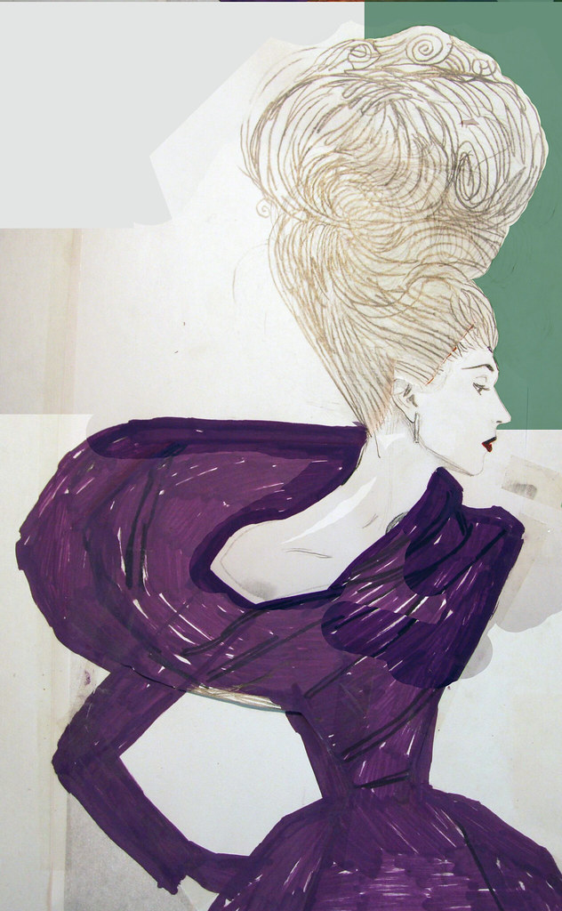
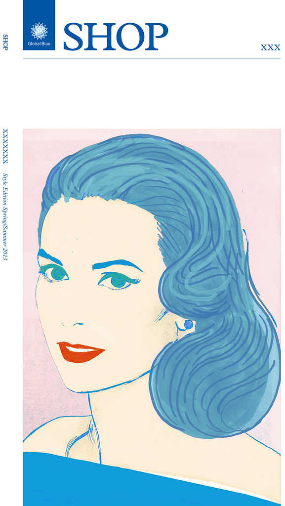
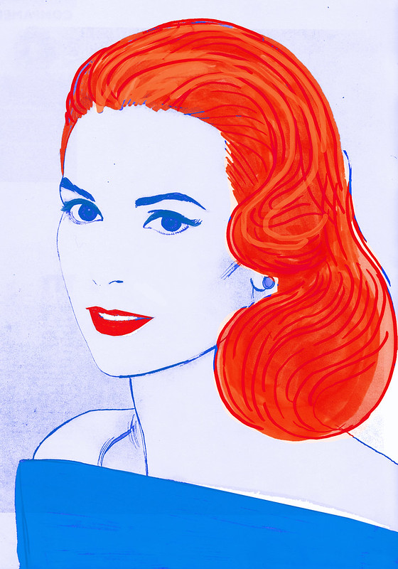
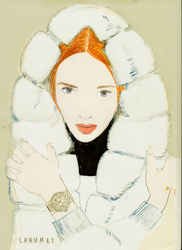
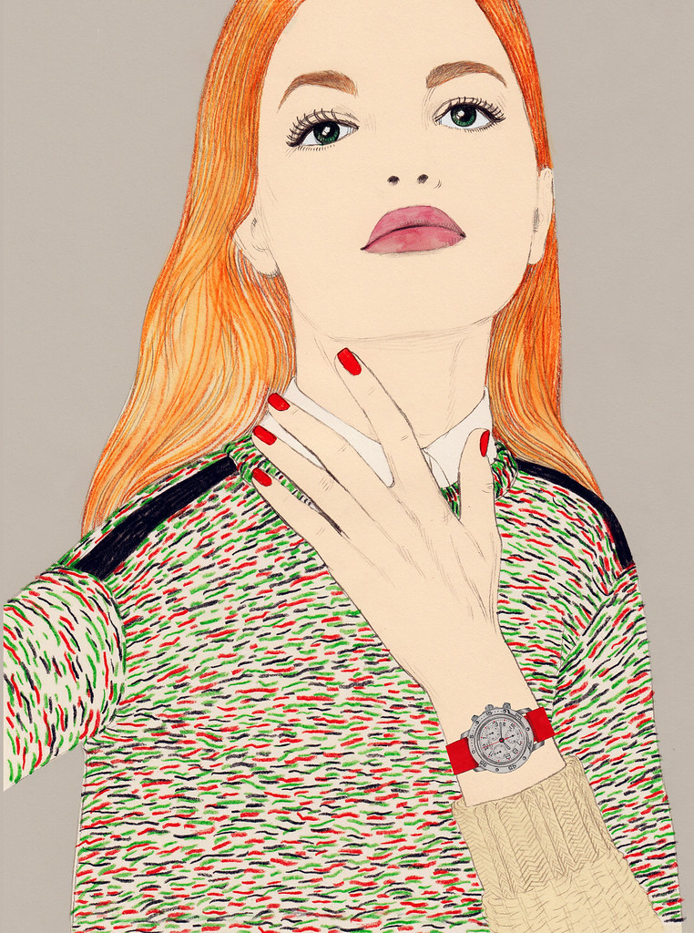
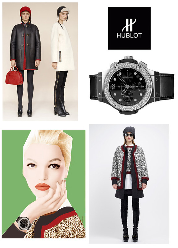
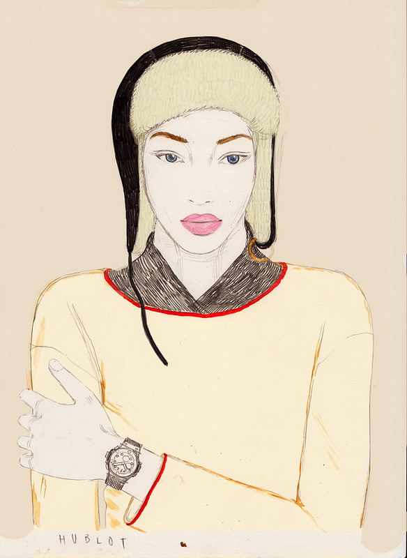
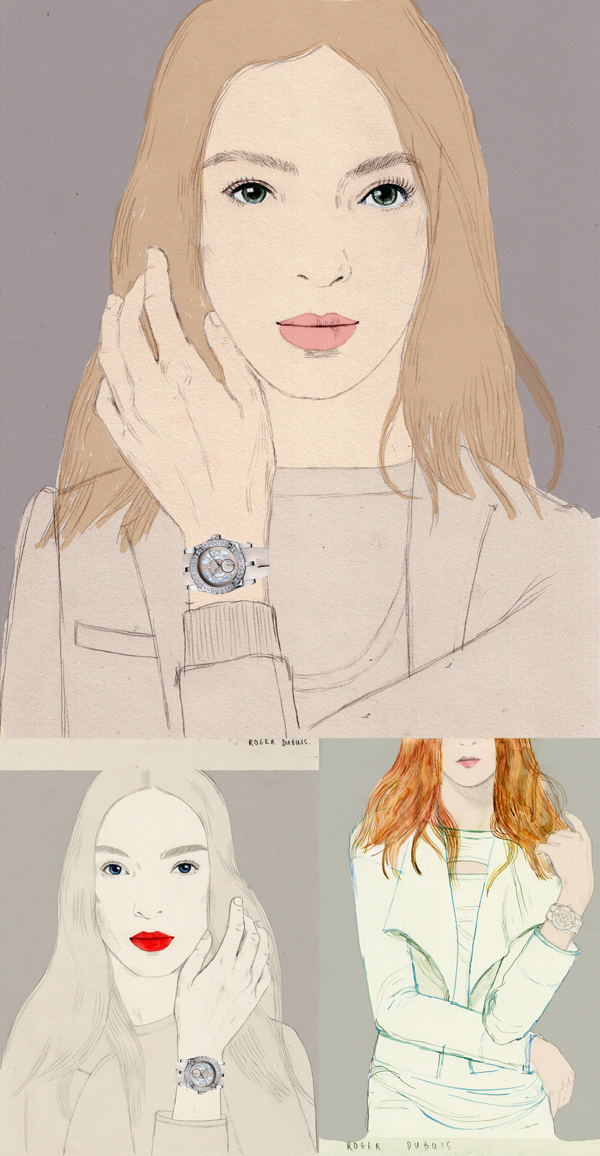
I recently completed this assignment for Chronos FEMME in Japan.
Chronos Femme is a watch and jewellery magazine for ladies which is published bimonthly. It is a sister magazine of Chronos Japan, a mechanical watch magazine for men cooperated with Chronos Germany. Chronos FEMME is given to the customers interested in luxury watches and jewelry at official watch shops and department stores in Japan.
The assignment was to draw six ladies wearing one brand watch each, and the brands featured were Rolex, Roger Dubuis, Chaumet, Hermes, Hublot and Omega.
Scroll down to see the images, sketches, and reference images...
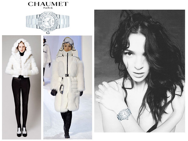
CHAUMET
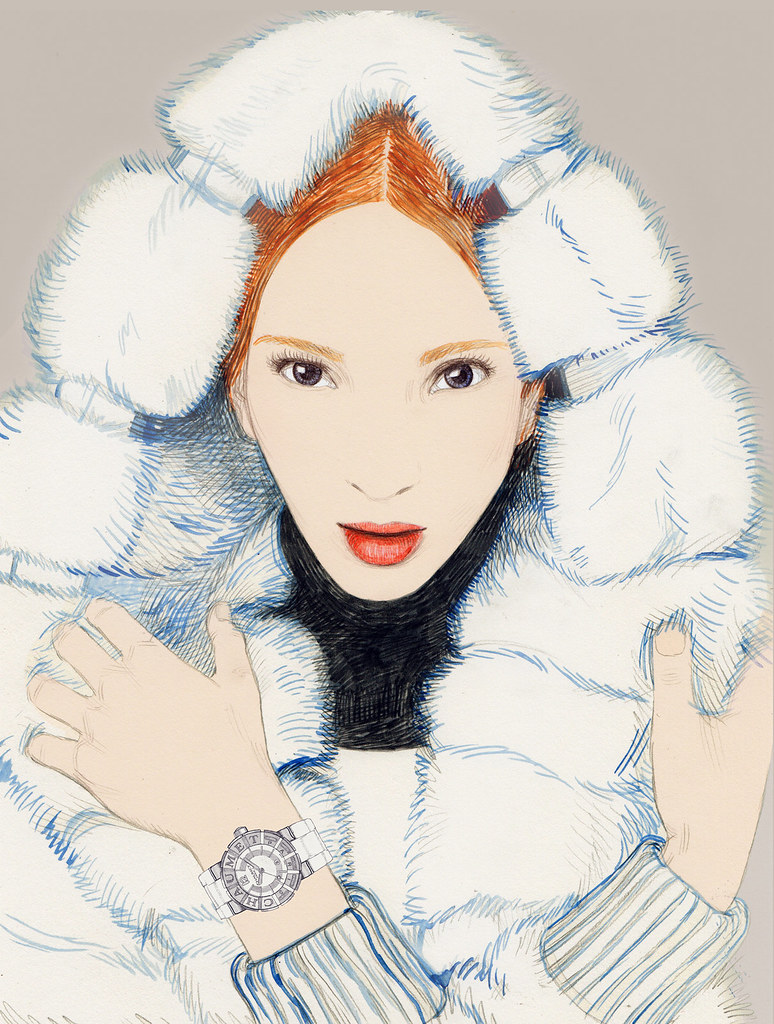
sketch & reference images:
HERMES
sketch & reference images:

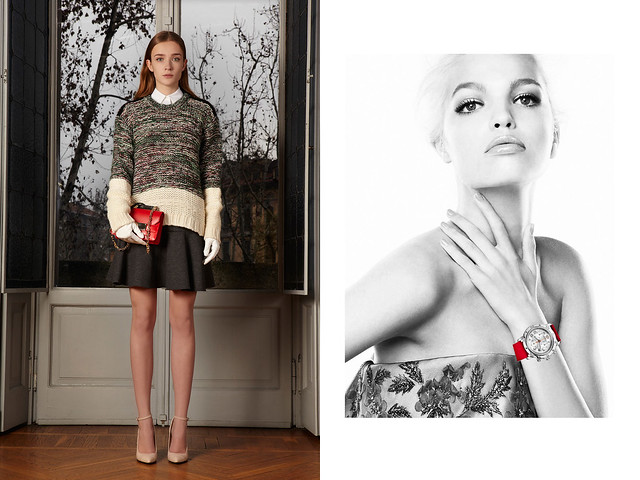
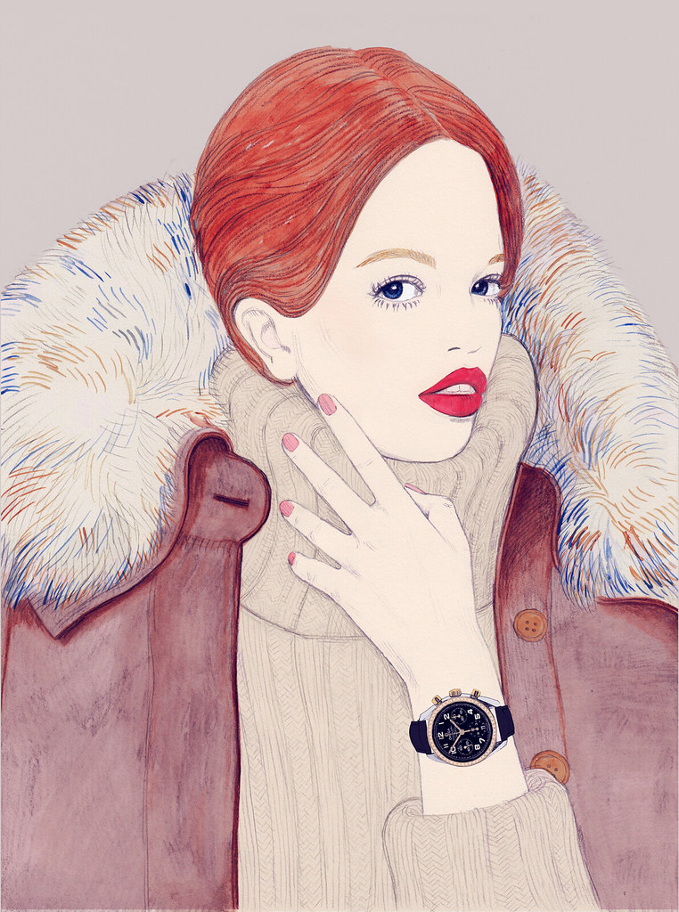
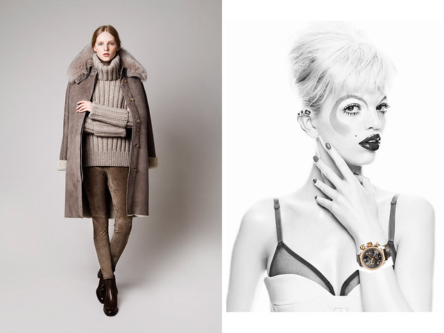
HUBLOT
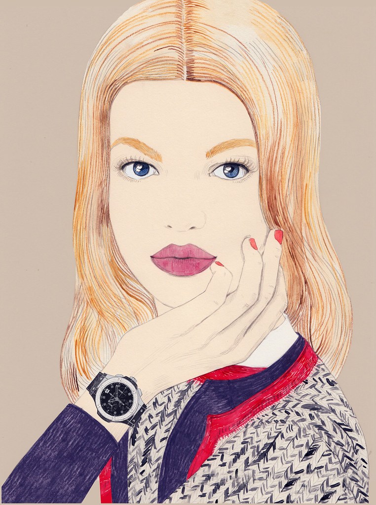
sketch & reference images:
rejected 1st concept sketch:
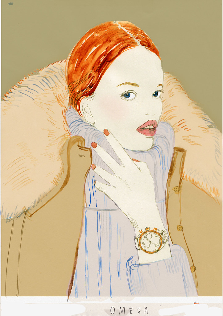
OMEGA
sketches & reference images:
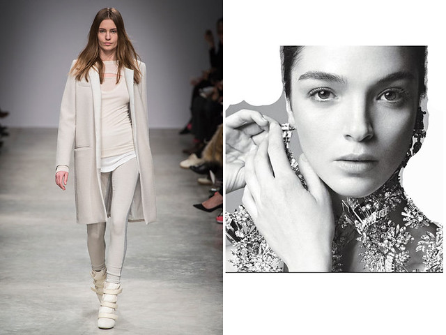
ROGER DUBUIS
sketches & reference images:
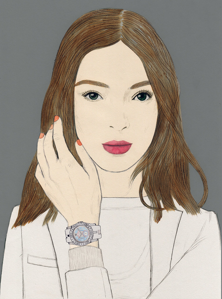
ROLEX
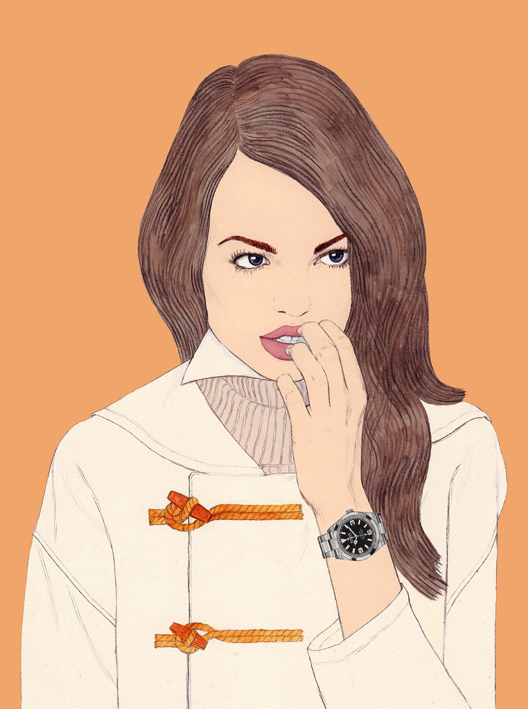
sketch & reference images:


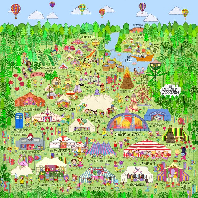
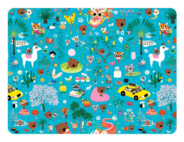
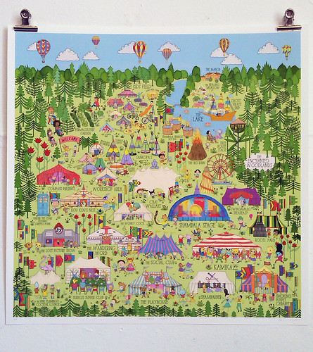
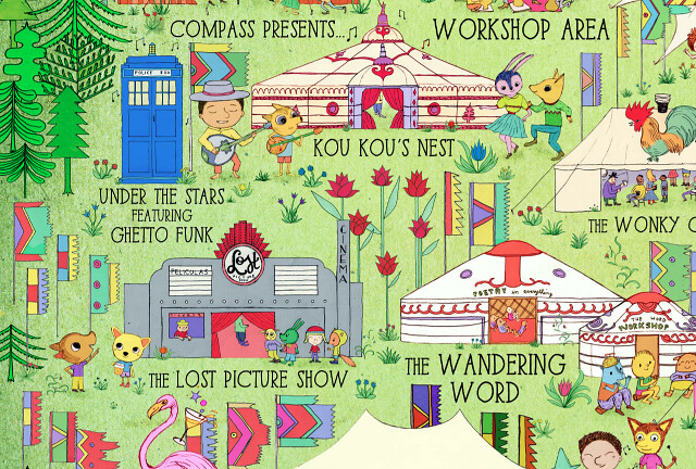
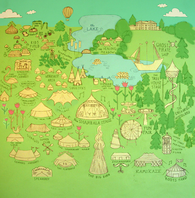
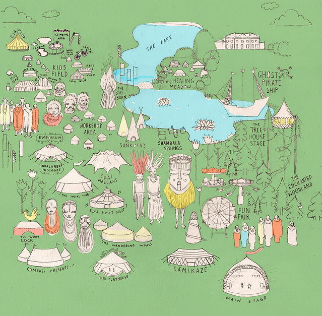
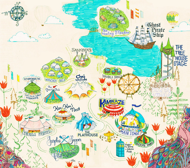
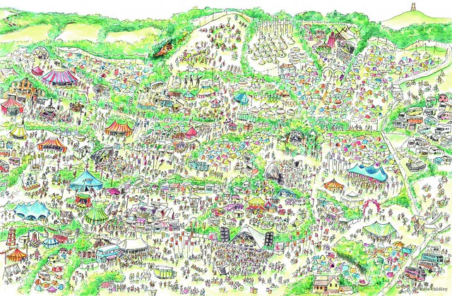
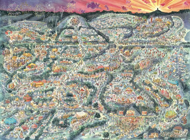
This is a map I created over the months leading up to this years ever magical, ever wonderful, Shambala festival.
The map was NOT intended for navigating around the site - it was more intended as a decorative, fun, promotional illustration of all the fantastic things that Shambala has to offer.
The map however was printed in the first page of the festival programme - and this probably led to quite a few people trying to use it to find their way around, and probably getting very lost - not many things were in the right spot! (I was basically just given a list of venues to include, and then more or less place them wherever I wanted.)
But then again, maybe that was the idea - the best times at festivals are often the ones where you end up somewhere you never expected to find...
It was LONG and challenging process making the map, but it was also a lot of fun, and extremely satisying when I finally finished and got to see and share the end result.
ps. Where's Wally tip: There's a secret portrait of me and my boy hidden in the map - can you spot us?
If you would like to order a print at a custom made size (it could be as big or small as you like), email me at annahiggie@gmail.com
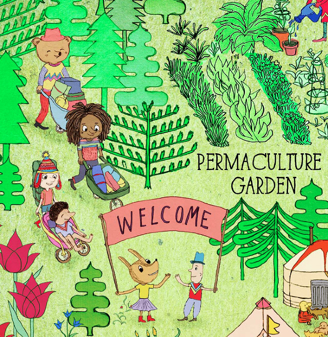
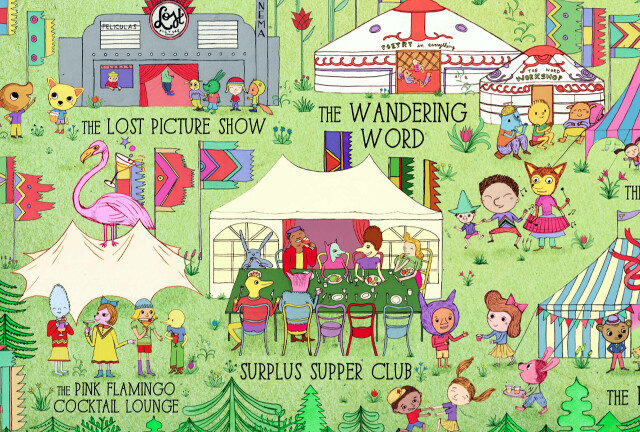
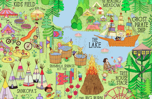
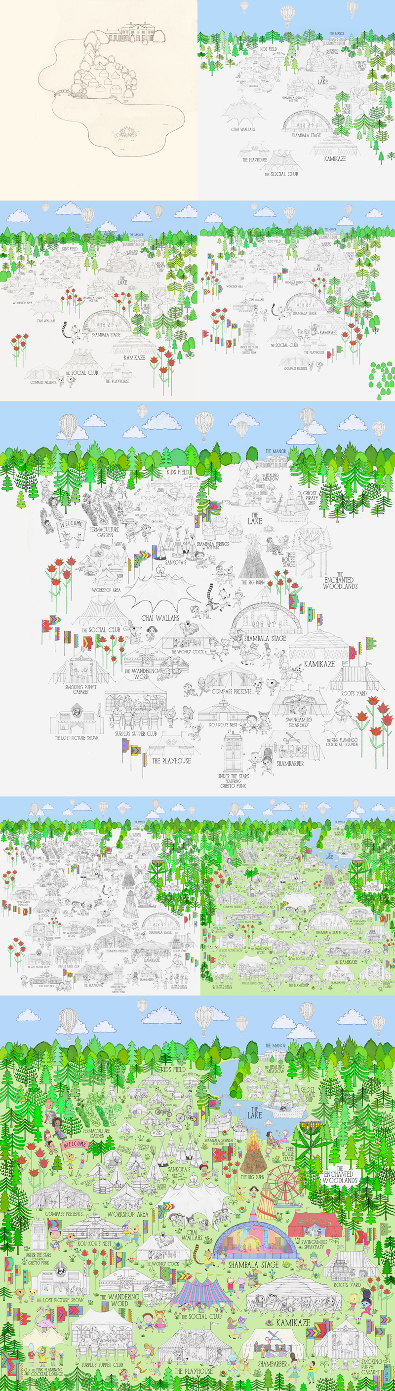
Basically, I drew every element separately, and then knitted it all together and added colour in Photoshopo. This meant I could move everything around and play with different colours, sizes, and compositions along the way.
I felt that if I'd tried to do everything on one piece of paper, it would have been a lot harder to change things, and it would also have been very difficult for me to scan well. Here are some examples of individual elements that eventually all got married all together into one big final piece:
3rd sketch (last one before going to final image):
2nd Sketch:
Initial 1st sketch:
Here are some other maps made for festivals that I had a look at when researching the map and figuring out how the hell I was going to tackle this project (having never made a map before in my life - quite a daunting task at first):
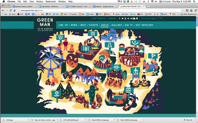
This years Green Man map (my personal fave, I love this aesthetic):
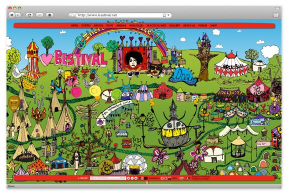
Bestival:
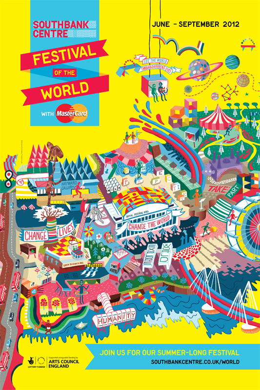
The Southbank Center Festival of the World:
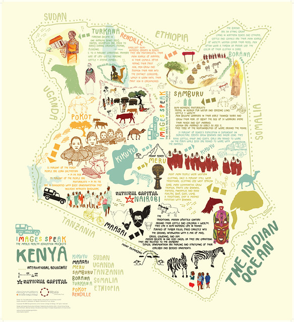
Here's a small selection of other maps I looked at and liked when researching for the map:
INSPIRATION FROM OTHER ARTISTS...
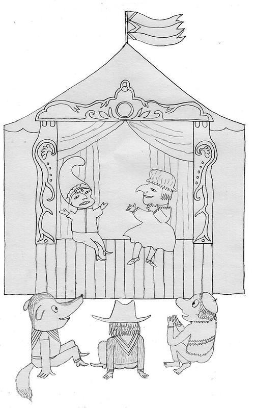
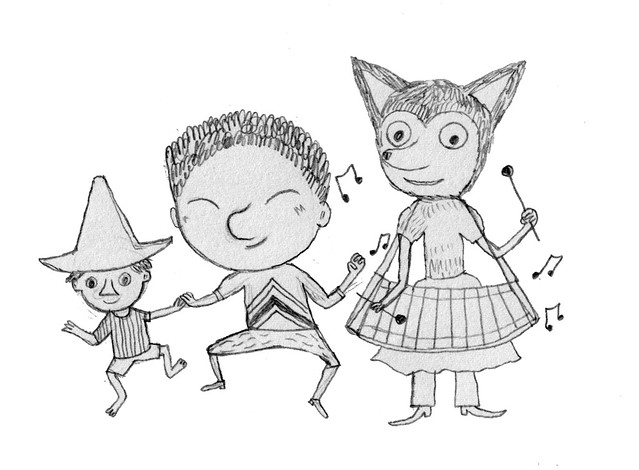
The incredible Marc Boutavant, one of my favourite illustrators, was a big inspiration when it came to creating the characters in the map, which is something I haven't done very much before.
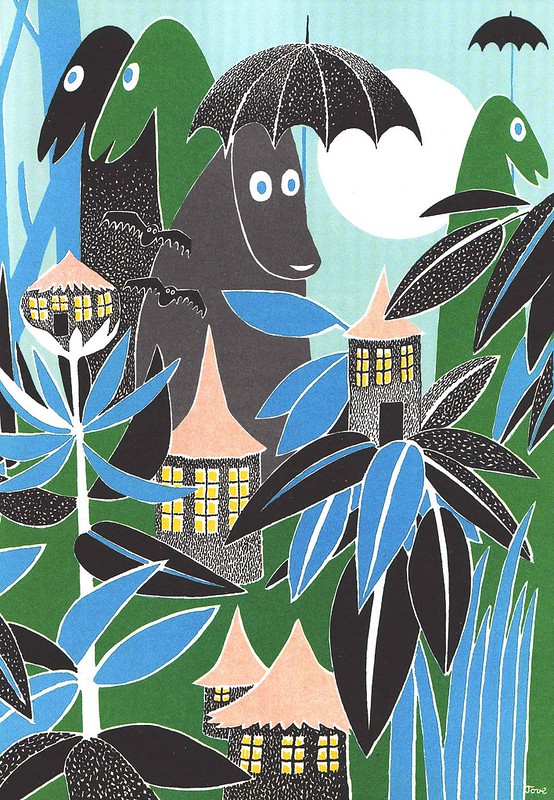
I was also looking at characters created by Moomins creator Tove Jansson (and the treehouse - see below - is pretty much copied from a treehouse in one of my all time favourite books, Who Will Comfort Toffle - a must have for children of all ages, and adults too)
A lot of inspiration in terms of general composition and character design also came from fellow Jamaica Street superstar illustrator Bjorn Rune-Lie (who was a big inspiration when it came to drawing the stylised trees in the forest as well, I must admit):