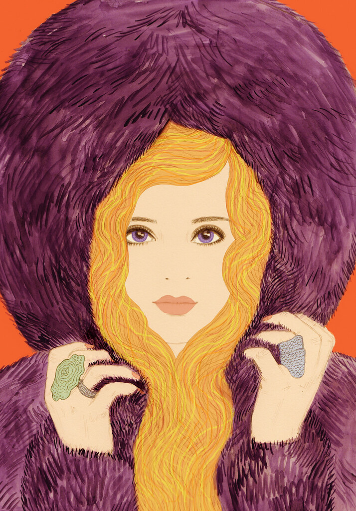
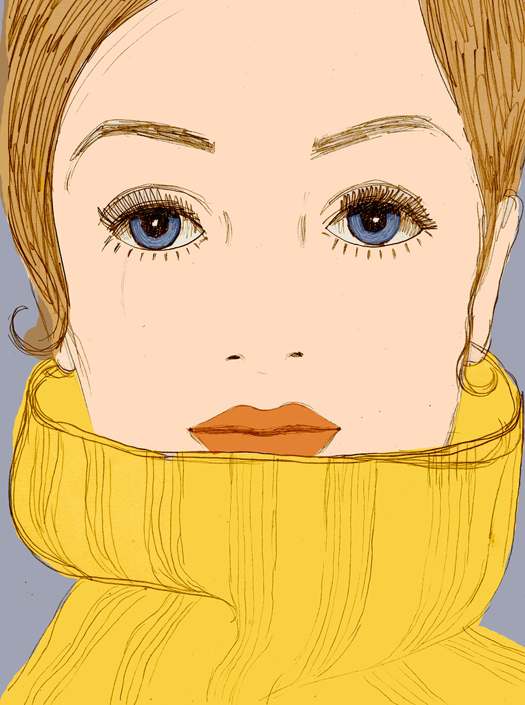
This is an illustration I created in July for SHOP Copenhagen.
The Copenhagen issue was released to coincide with Copenhagen fashion week. Brands who showed at CFW feature in the issue, and one of the running themes is 'daring Danish design', bold design with a quirky but still very elegant edge very much influenced by the 1960s.
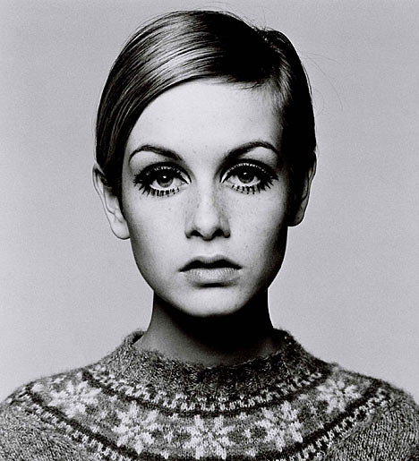
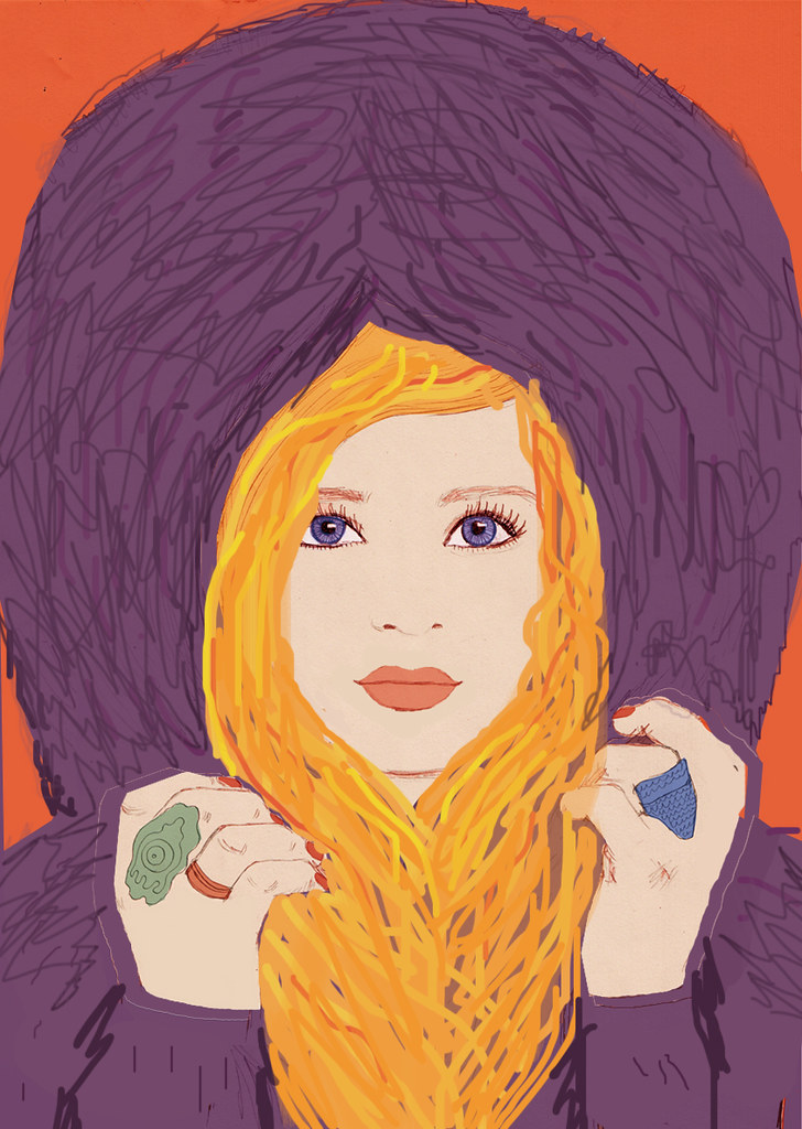
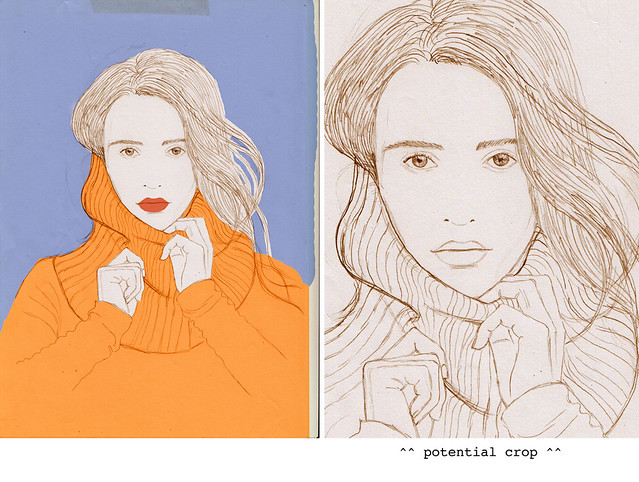
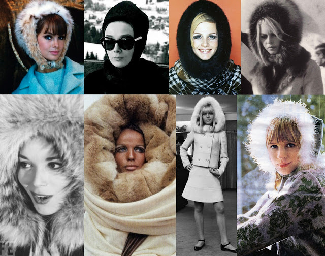
The editor wanted 'a straight on portrait of a figure surrounded by a big fluffy roll-neck jumper - very 60s esq - really exaggerated as though the jumper is going all up around her face, her head almost filling the frame, big hair coming over the jumper and filling in the frame above. Really bold, a bit quirky but also looking really sophisticated. Her hands could be holding the jumper fabric as though holding it up around her face a bit, enjoying the fabric.
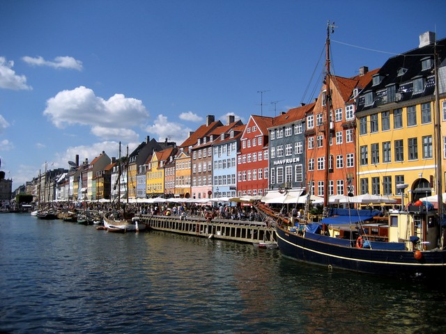
Colour wise, we'd love to include hits of colours from the buildings in the Nyhavn area which are very iconic to Copenhagen.'
SKETCHES:



No comments:
Post a Comment